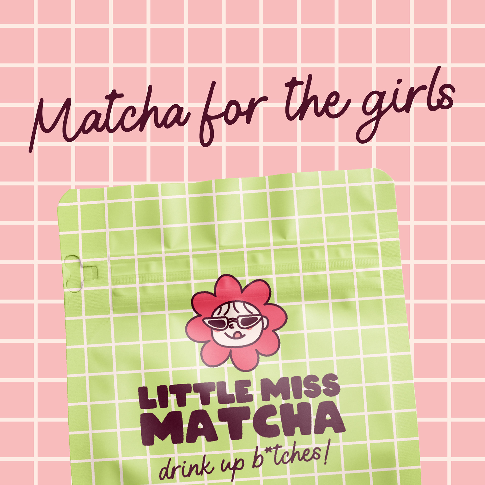
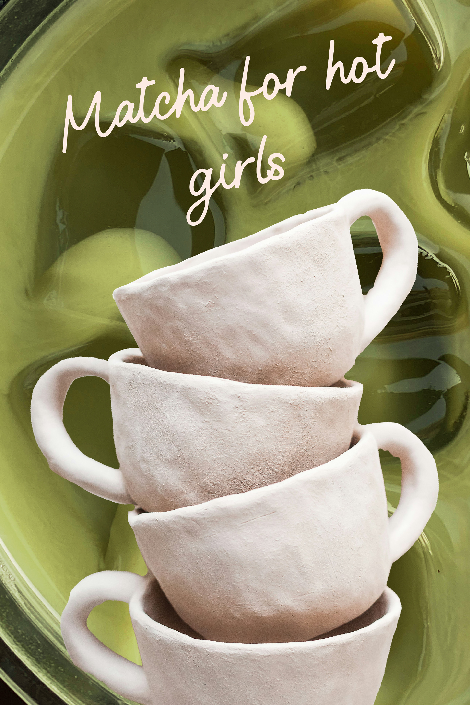
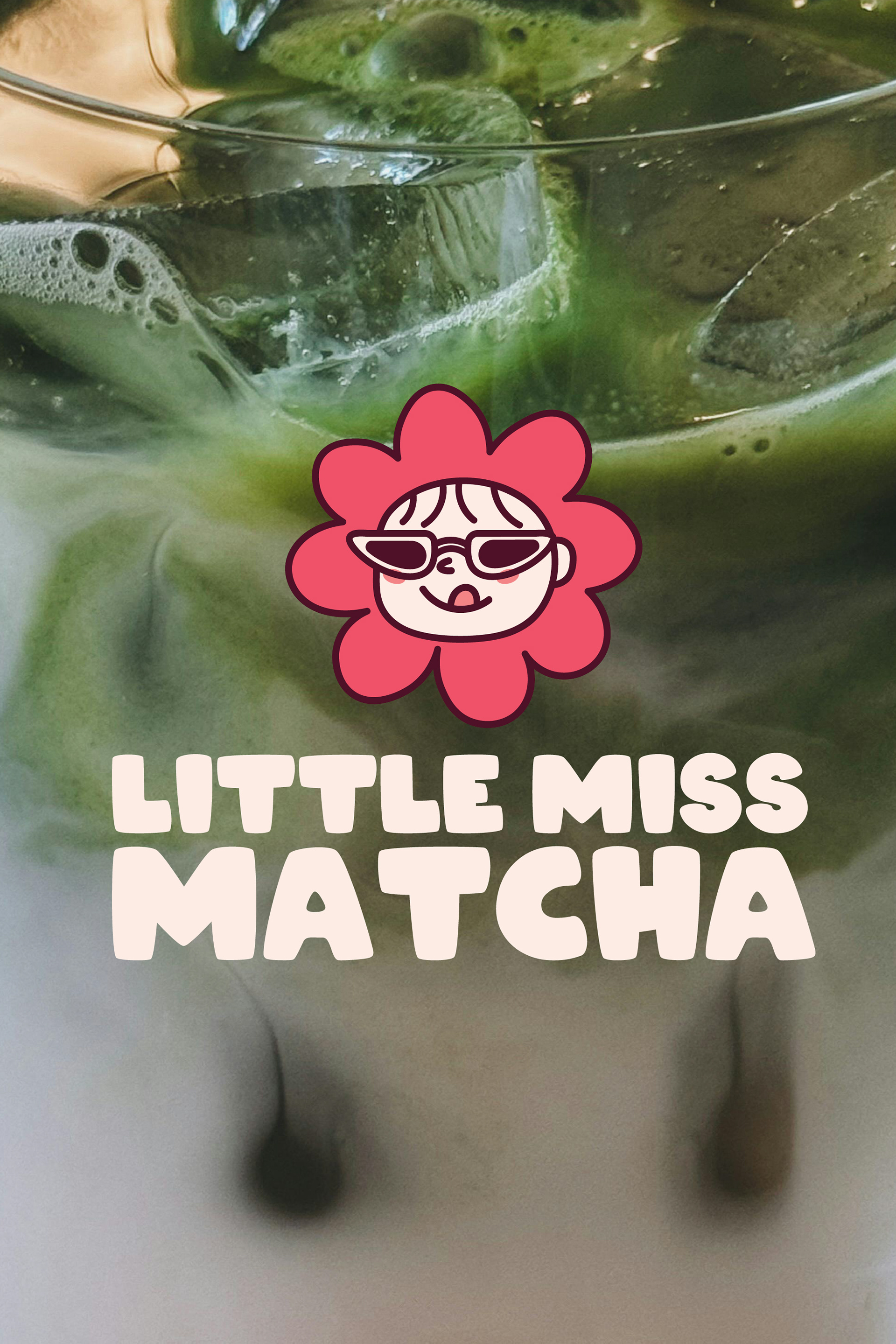
Little Miss Matcha - Matcha for the girls
Role: Brand designer
Project Timeframe: 1 month
Industry: F&B, FMGC
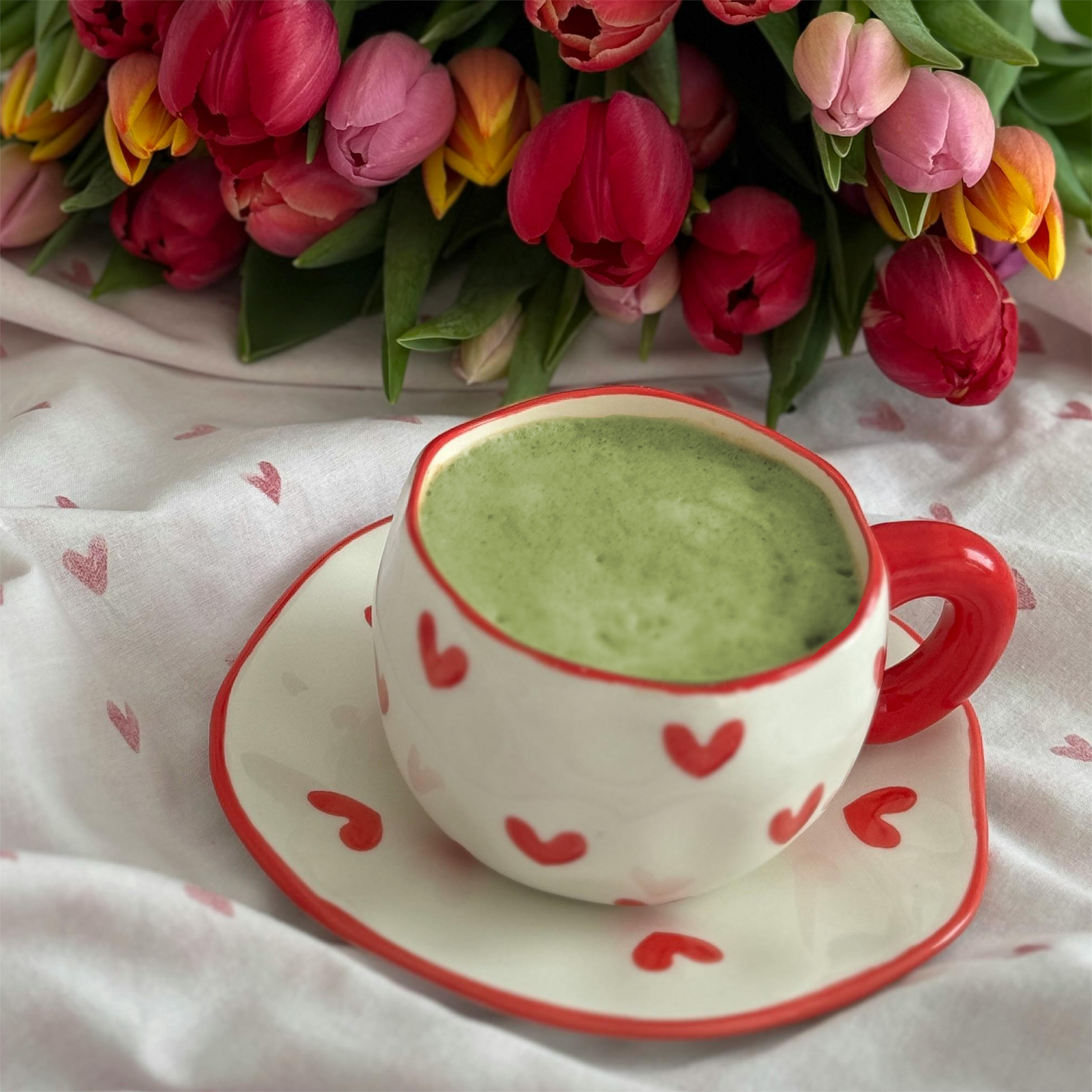
I'm matcha obsessed but it gets quite expensive if you have one every time you go out - So what if there was a matcha brand for the girlies but at home?
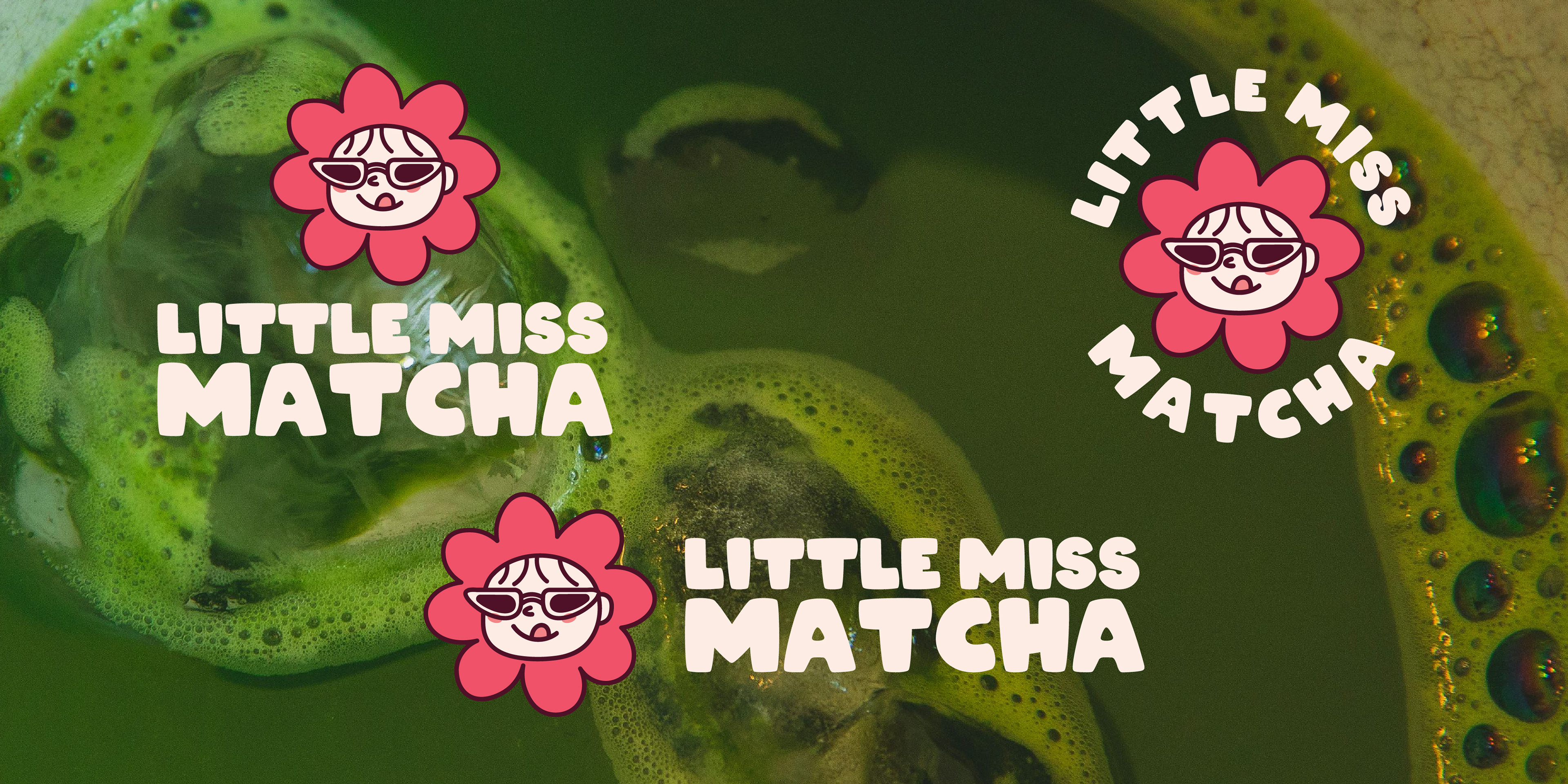
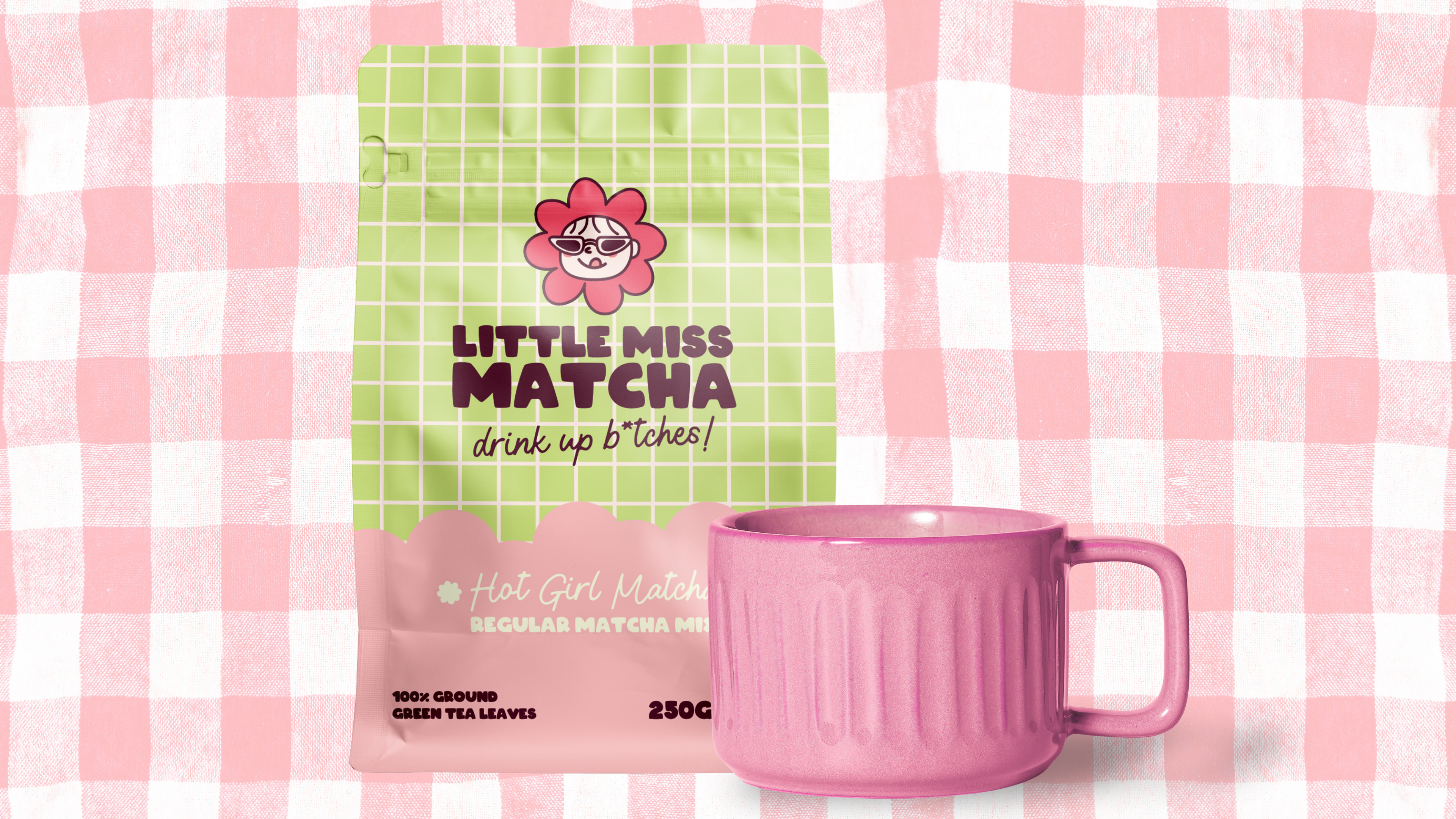
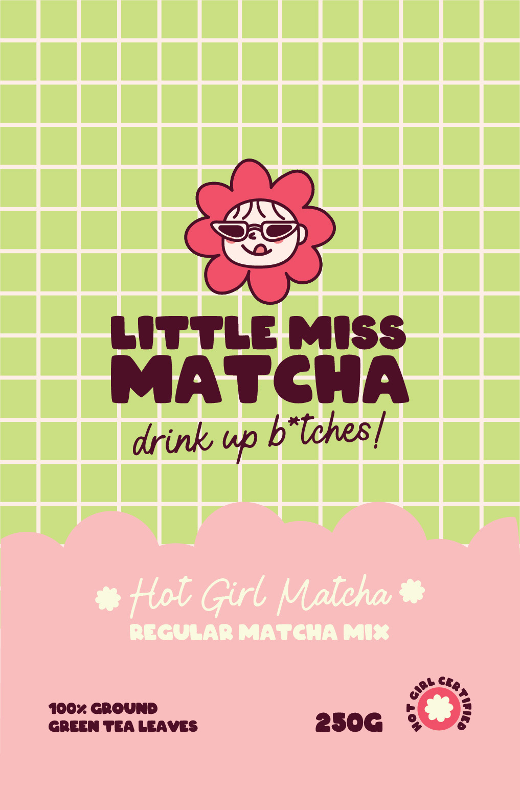
For the logo I wanted to use a mascot that fit the aesthetic, Little Miss Matcha is a sassy brand so I wanted to include sunglasses on the mascot.
The typography set is very simple but has a high contrast with two polar opposite fonts.
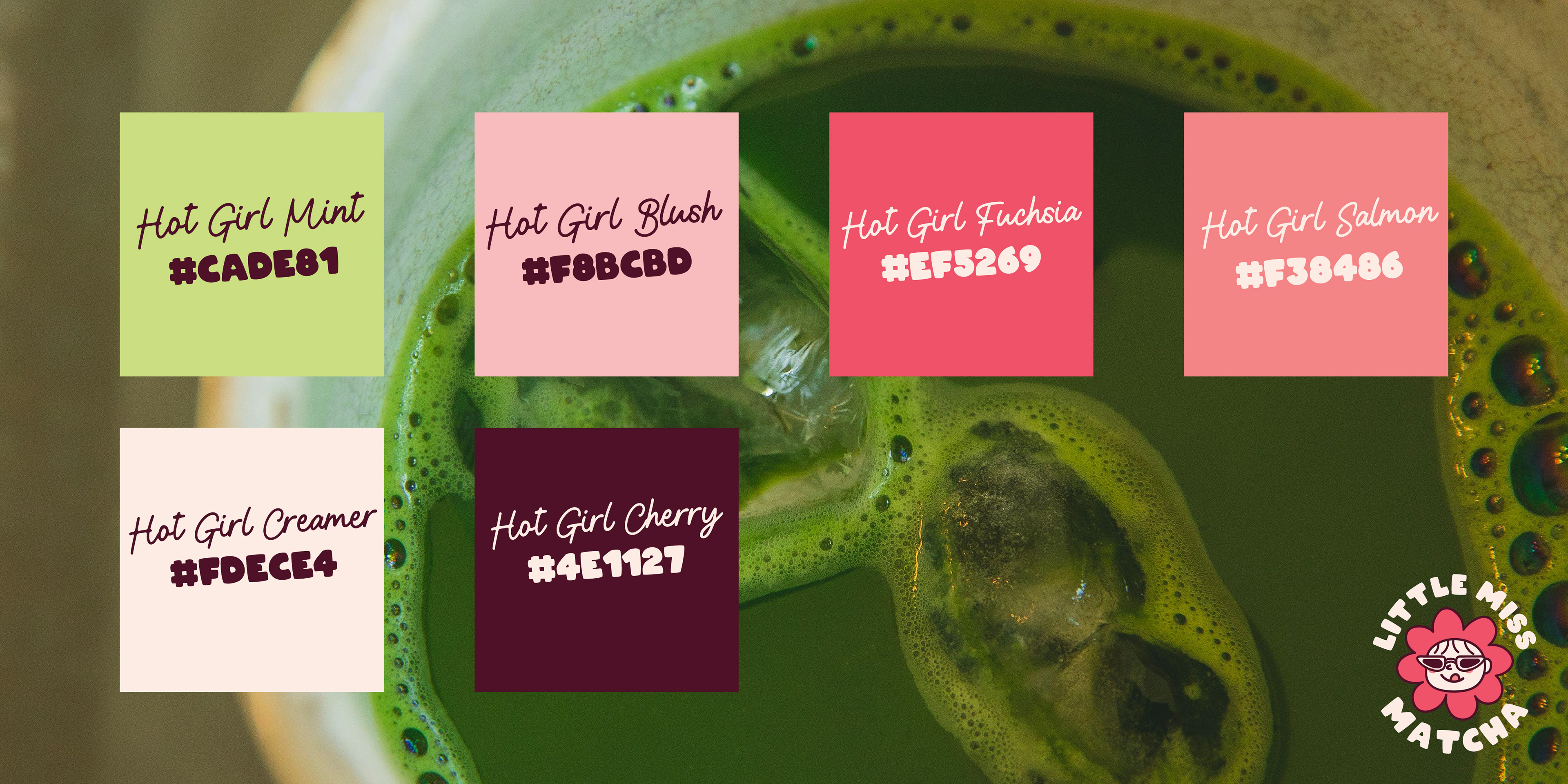
The colour palette focuses on pinks rather than green to give a little differentiation to the market.
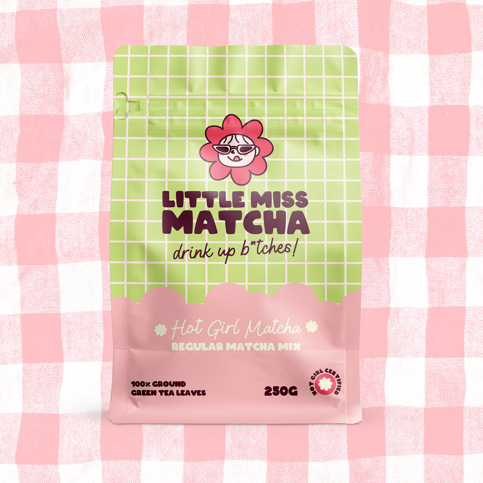
Front packaging artwork
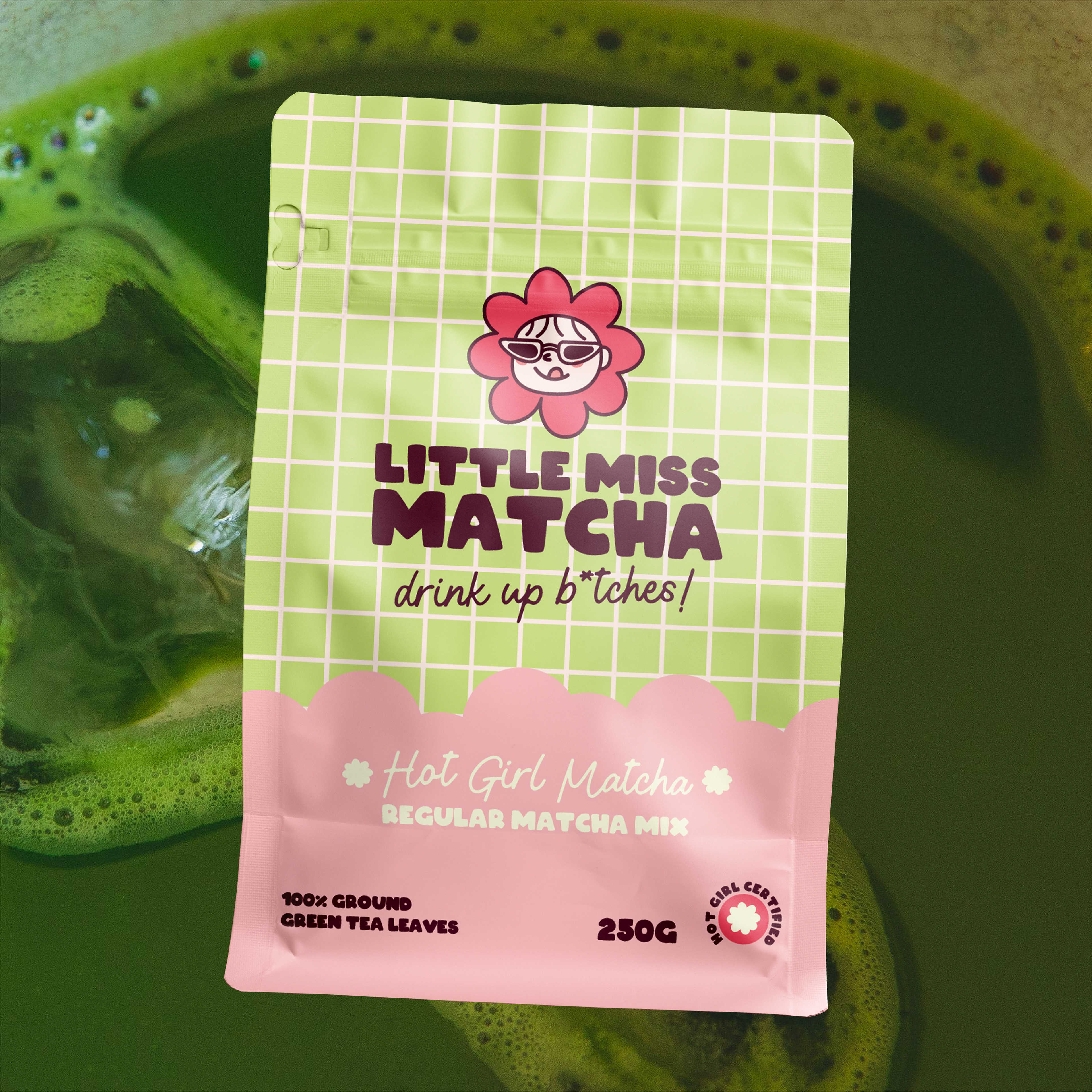
For the packaging design I wanted to use patterns as matcha is normally marketed as natural, calm and ceremonial but I think it can be all that without looking traditional.
A simple design that nods to different parts of the process - Matcha makes bubbles when you whisk it so I added a bubble cut-out shape on the front of the pack for a place for the important information to sit. Then adding flower shape icons for references to the tea ceremony that normally includes a floral arrangement.
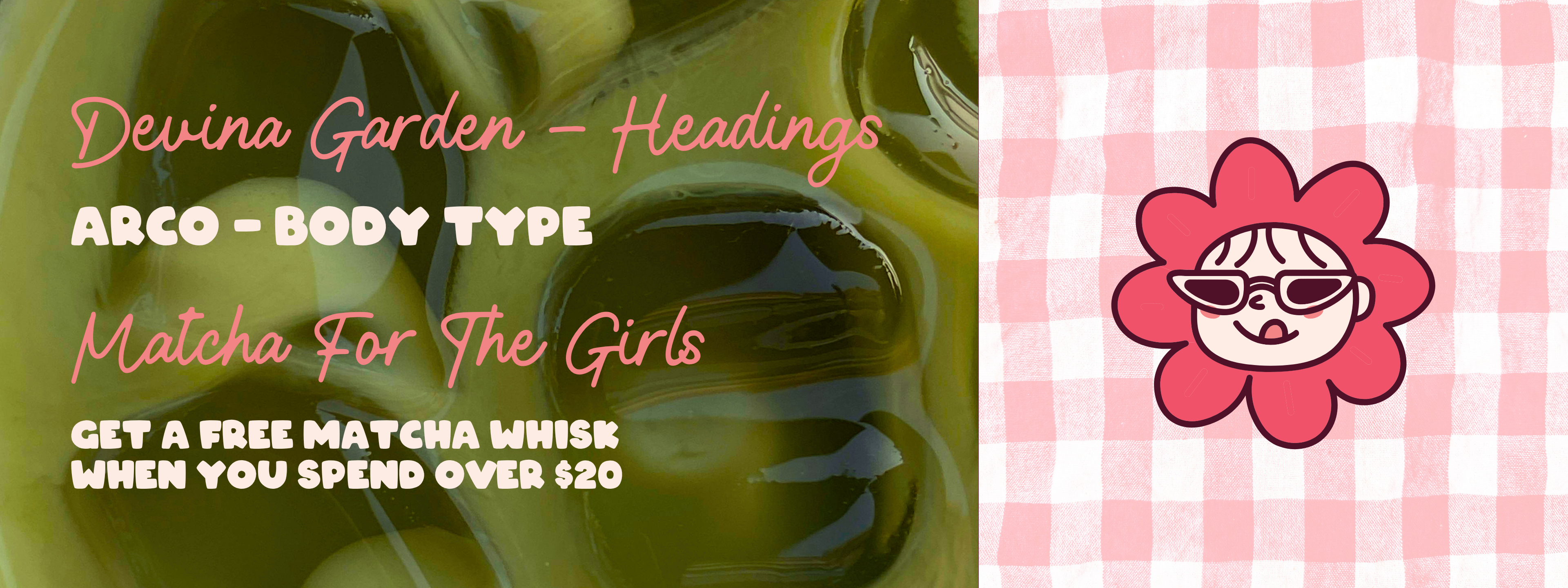
The brand is supposed to be a little bit sassy and unapologetically girly so that had to show in touch points other than the packaging.
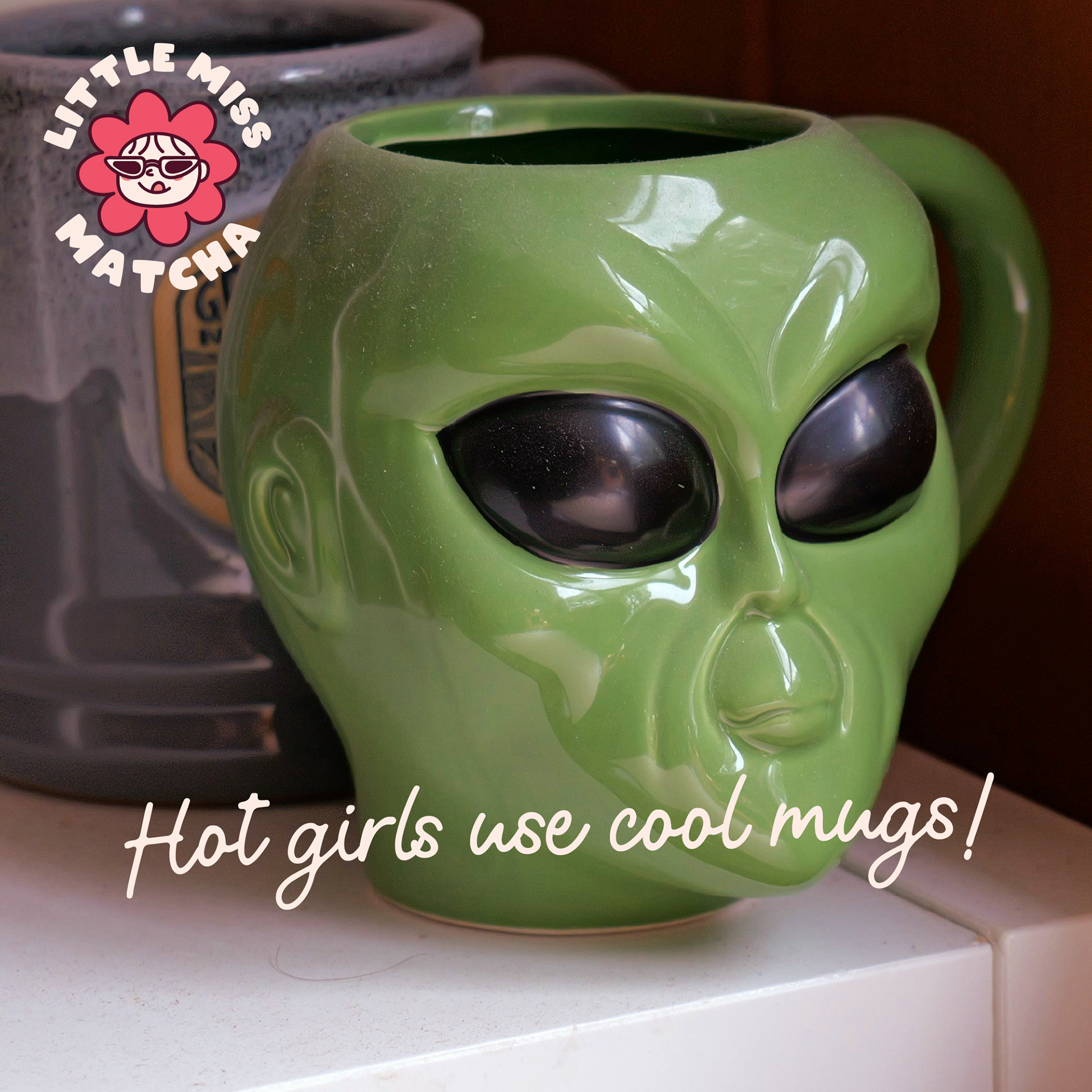
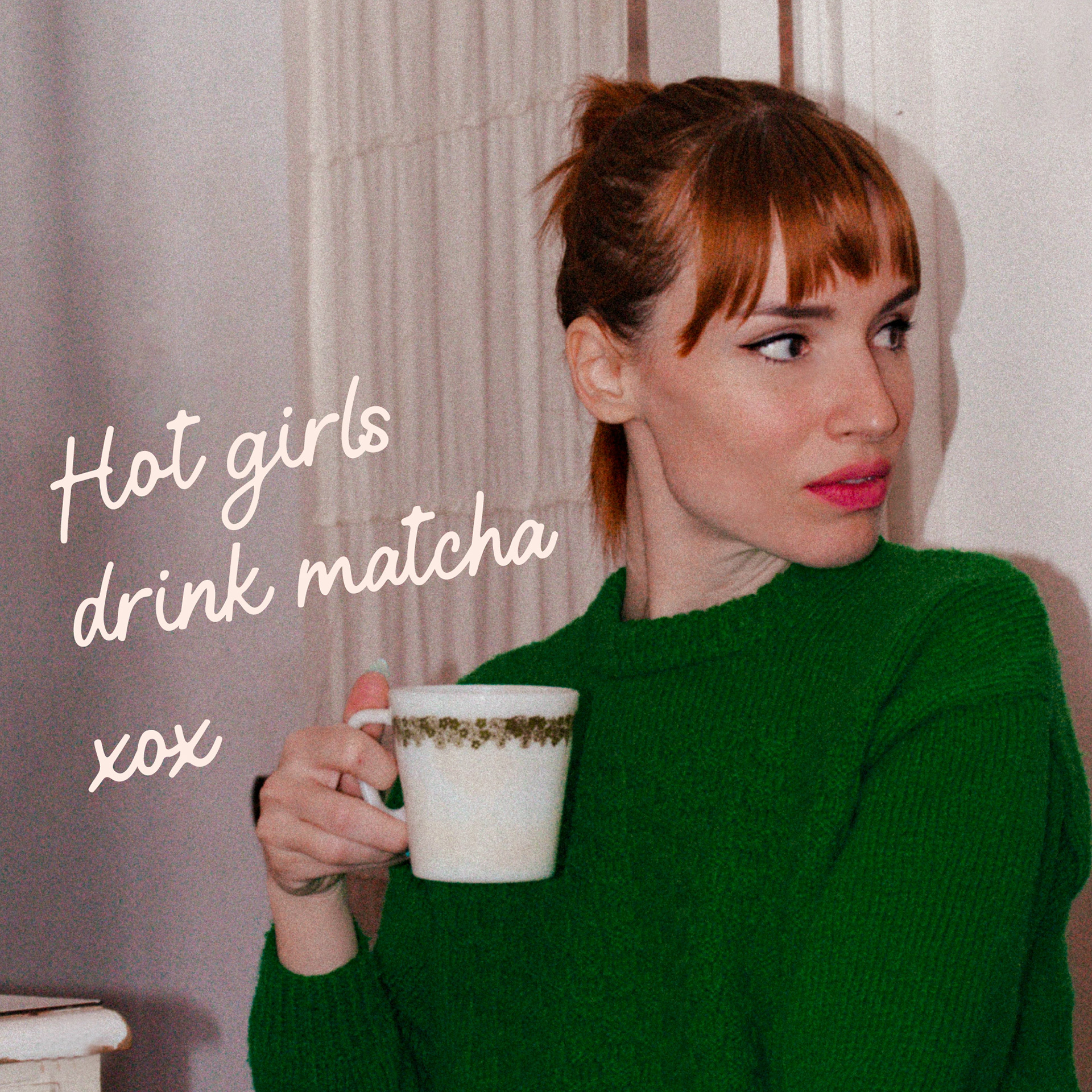
The social media direction is very sassy and to the point - if I were to expand on the brand I would focus on more marketing and product launches content.