Purely is a self-conceptualised cosmetic company, making purely natural products. The brand is confident while being down to earth, trying to connect with Gen Z without being too preachy.
I wanted to create branding that fits in with competitors while standing out with a vibrant colour palette and brand motifs.

When looking at other branding strategies from other cosmetic companies I found that a lot of them use gradients, grids and bold colours. So I made sure to adapt the branding to the current market while staying original.


On It's packaging Purely has a flower motif, I wanted to add more connotations to the brand's natural products while being subtle.
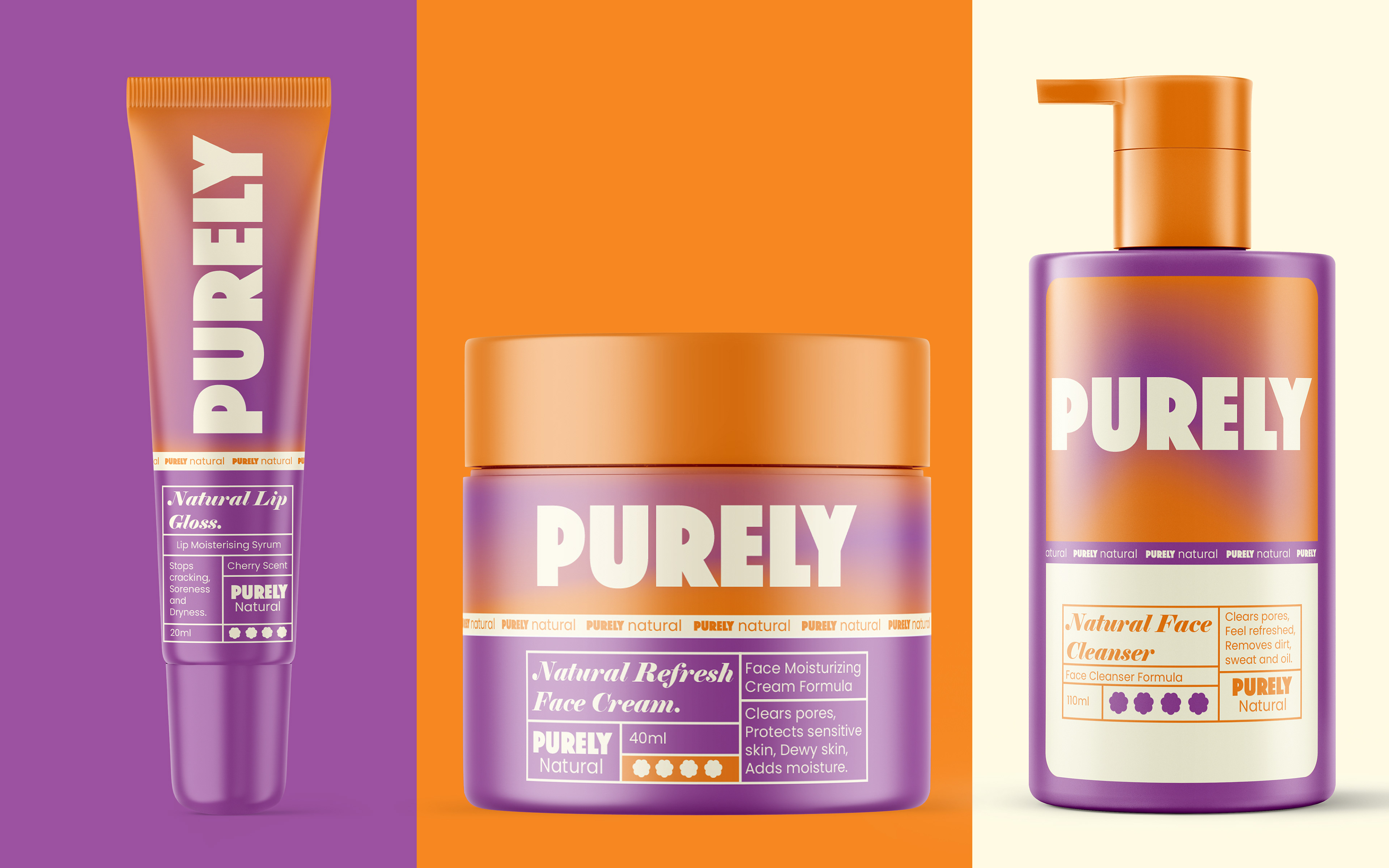
I chose purple and orange for the primary colour scheme because of the contrast and to steer away from gendered products.
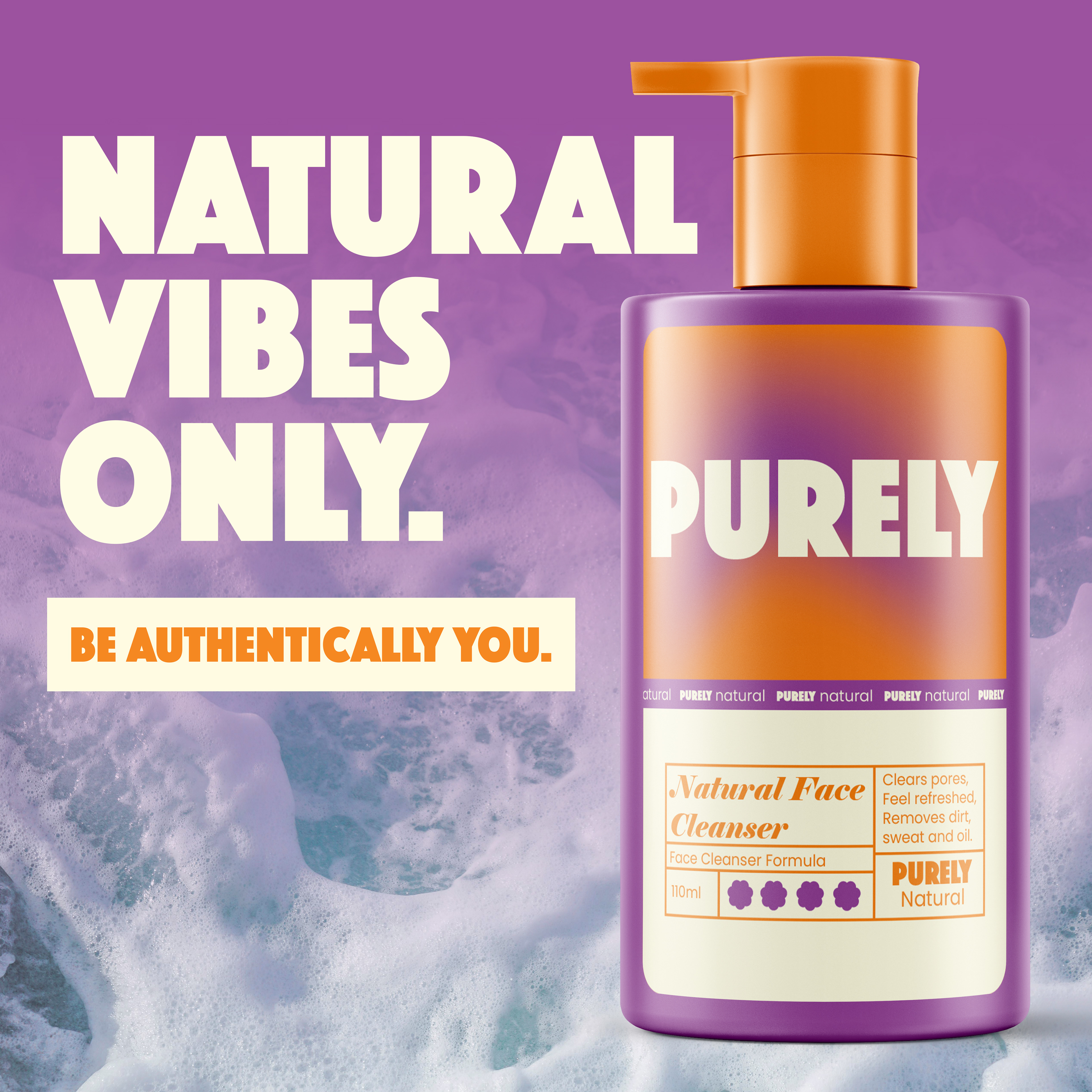
When coming up with marketing materials for the brand I wanted them to show the bold, trendy personality of Purely without being too much. I decided to go with some short one-liners accompanied by the product & brand tagline.

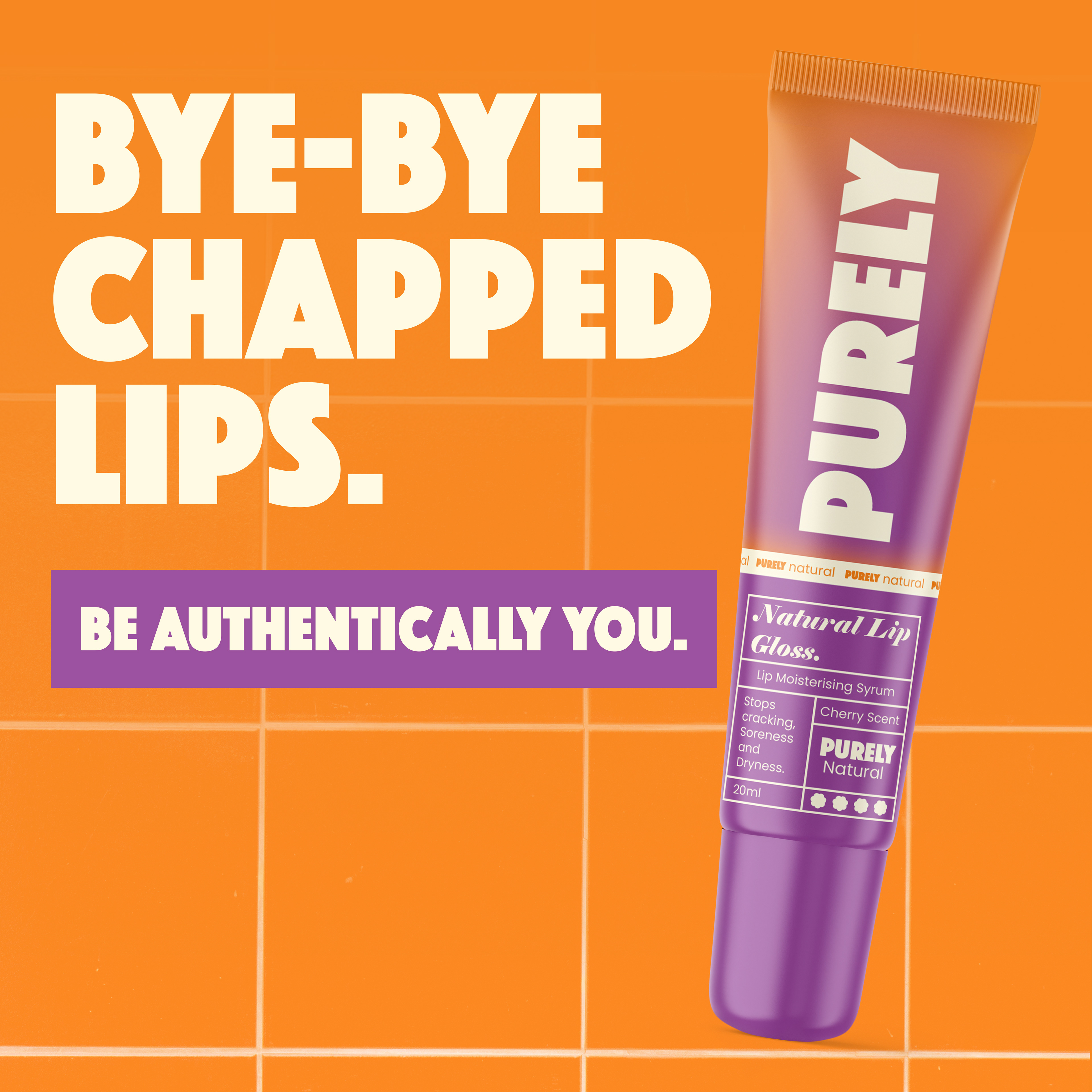

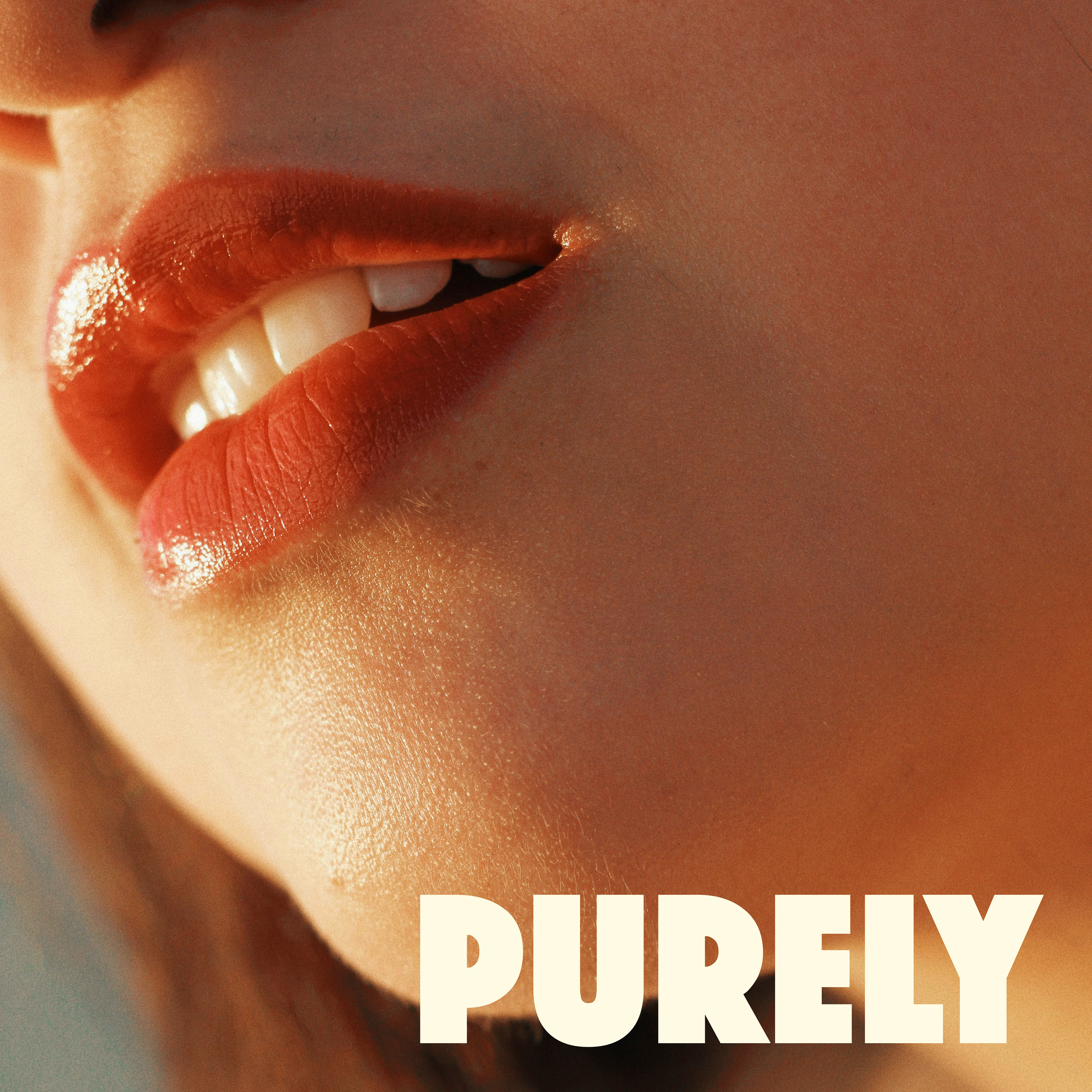
Purely is not a luxury cosmetics brand so when choosing stock imagery to use for the brand I decided on using close ups which makes the brand feel authentic as close up photos are almost candid. I did not want to pick any flashy imagery with bold makeup looks to reflect that the brand is for everyone.