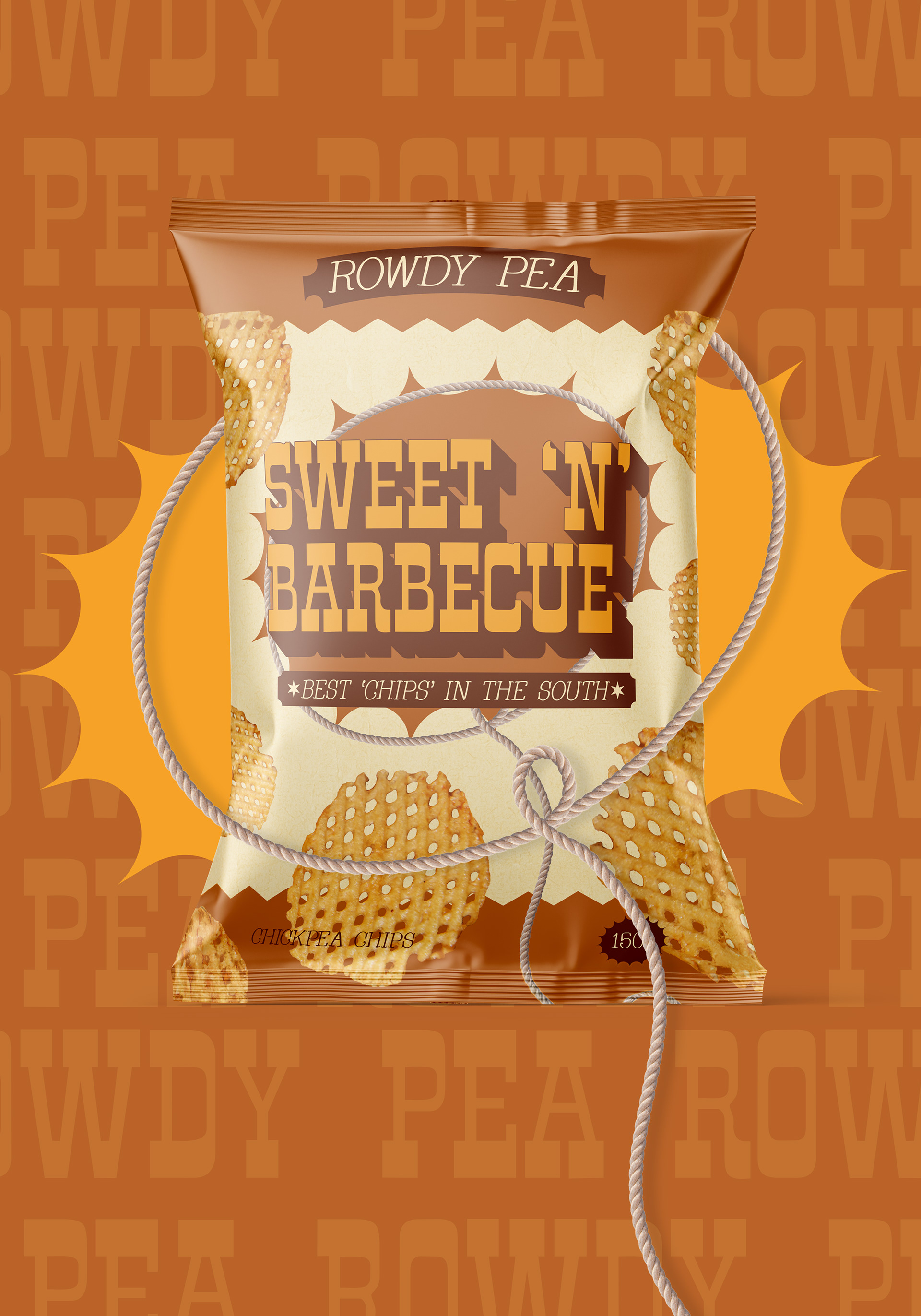
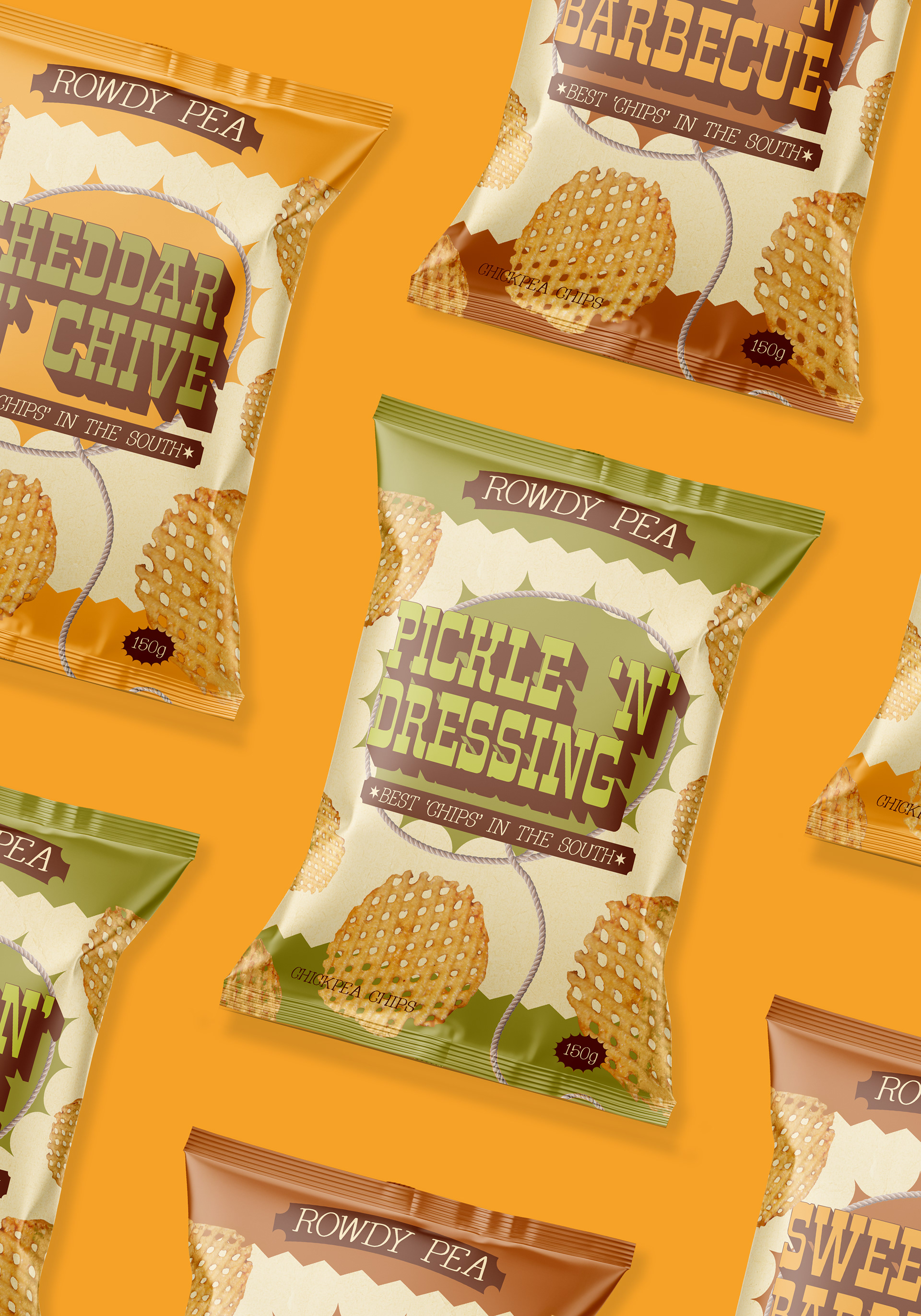
I love cowboy aesthetic and I think It's so in right now, so I wanted to make a brand with this aesthetic. I came up with a concept for a chip brand that sells chips made out of chickpeas, a healthy alternative for some cowboys.
The branding had to be fun while also being humble and authentic.
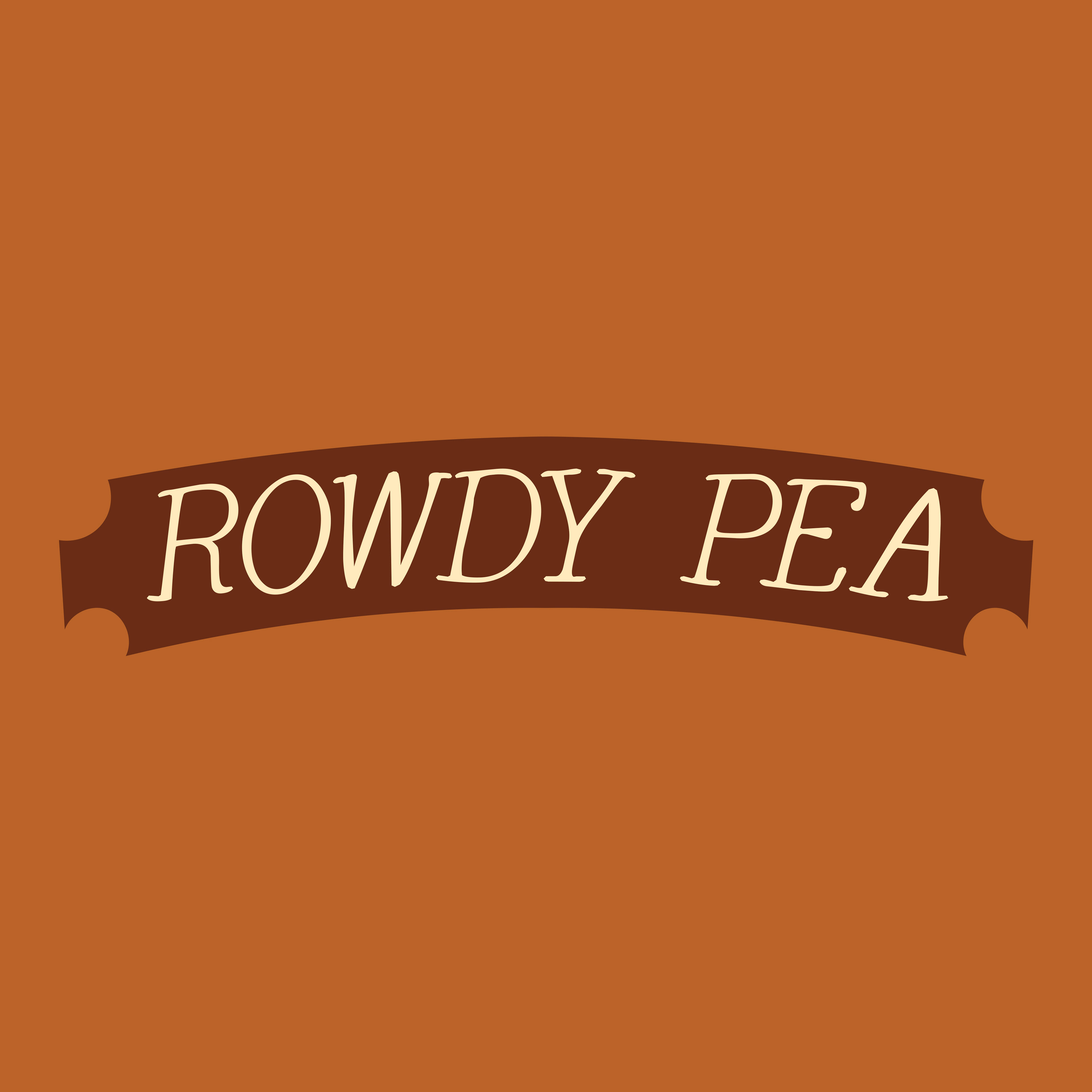
I wanted a simple logo for the brand as the other typography on the packaging would be bold and energetic.
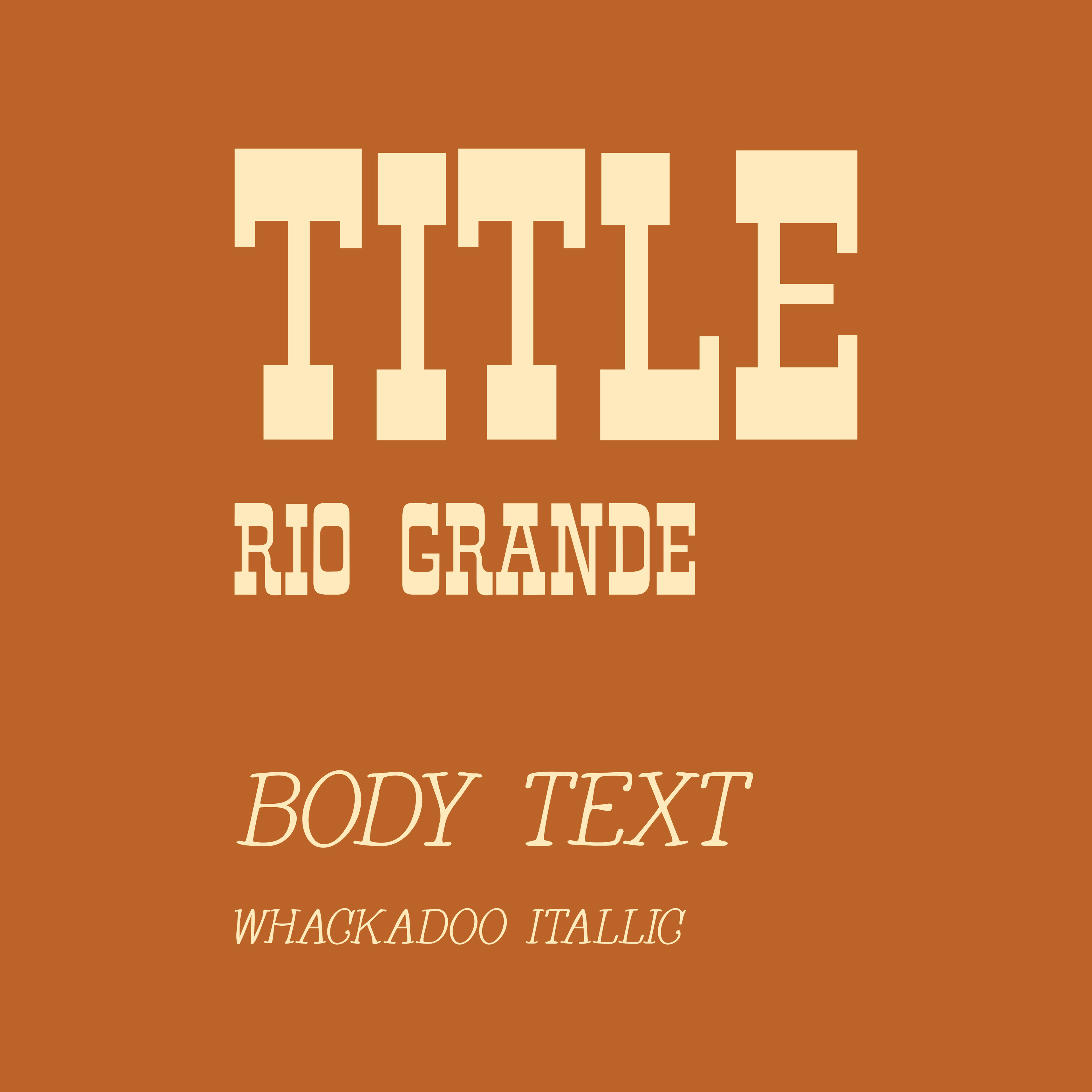
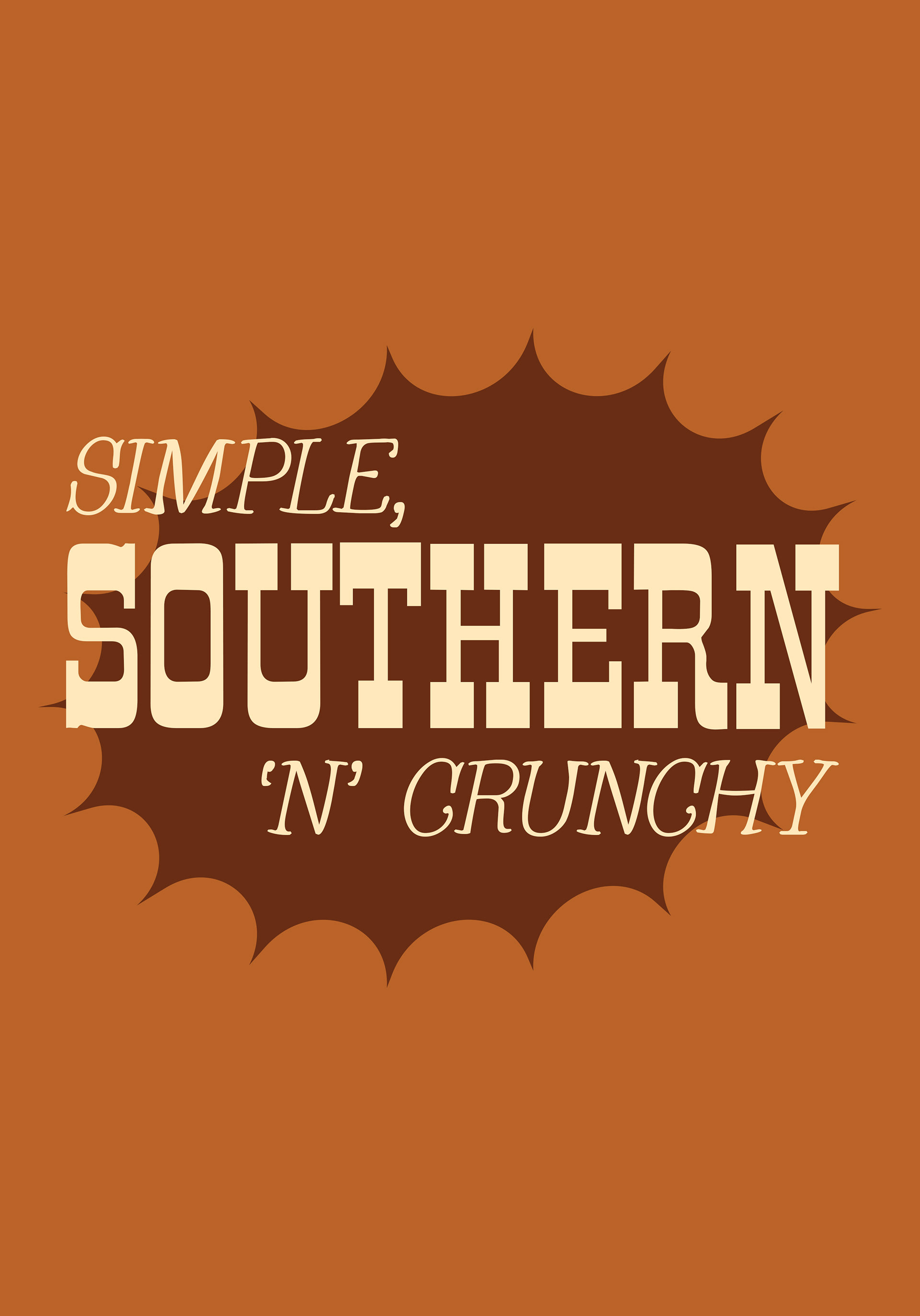
When looking for fonts I wanted to find a western typeface that had character too, Rio Grande had that.
My main struggle was living up to the brands name, 'Rowdy' is such a powerful word and I wanted to convey that through the packaging as before my concepts came across as bland.


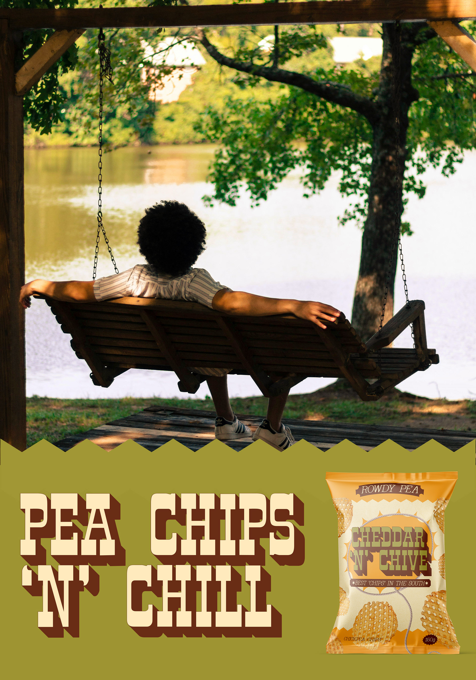

For imagery I used natural landscapes that gave a glimpse into a southern lifestyle. Images like fields, cacti, mountains and more.
The brand wants to scream that they're from the south while sharing that hearty feeling with everyone.
