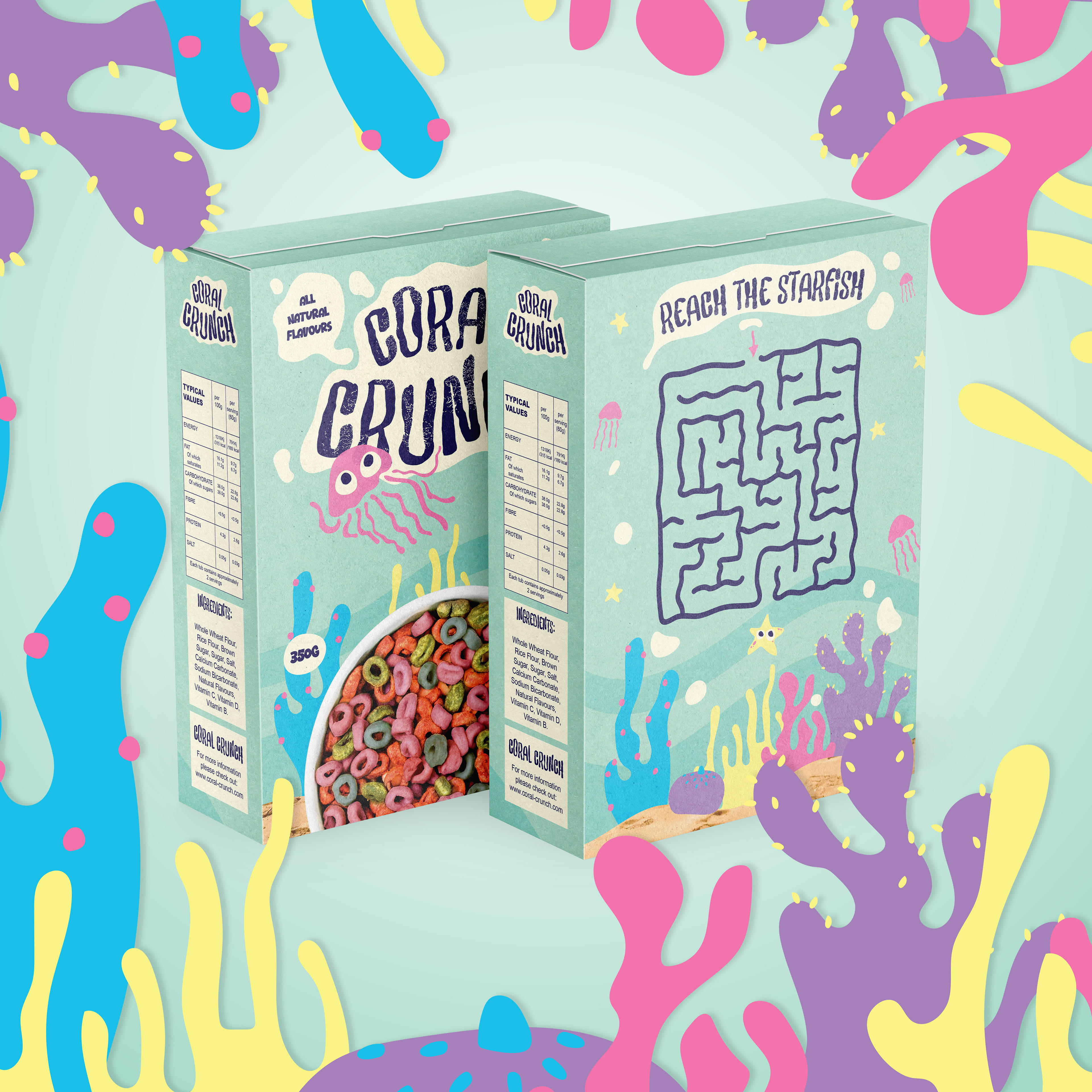
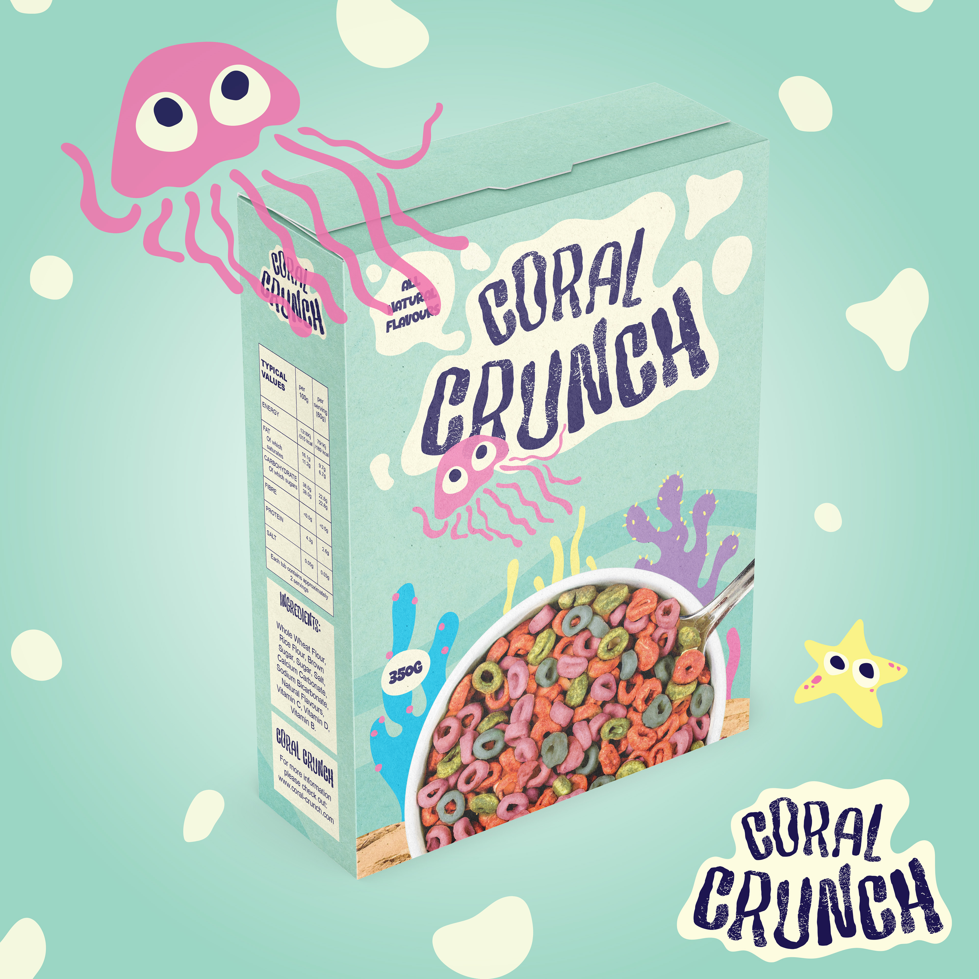
Coral Crunch is a self-conceptualised cereal company aimed at children. The packaging needed to fun with colourful illustrations, something I wanted to get back into. When creating packaging for this project I was heavily influenced by existing brands and their take on packaging aimed at kids.
When creating this design I wanted to use a lot of textures to emphasize the brand is natural but also to honour the brands contribution to recycling & clean-up projects. I chose to kept illustrations simple as coral is not something a child would be seeing every day - so some may not know what coral even looks like.
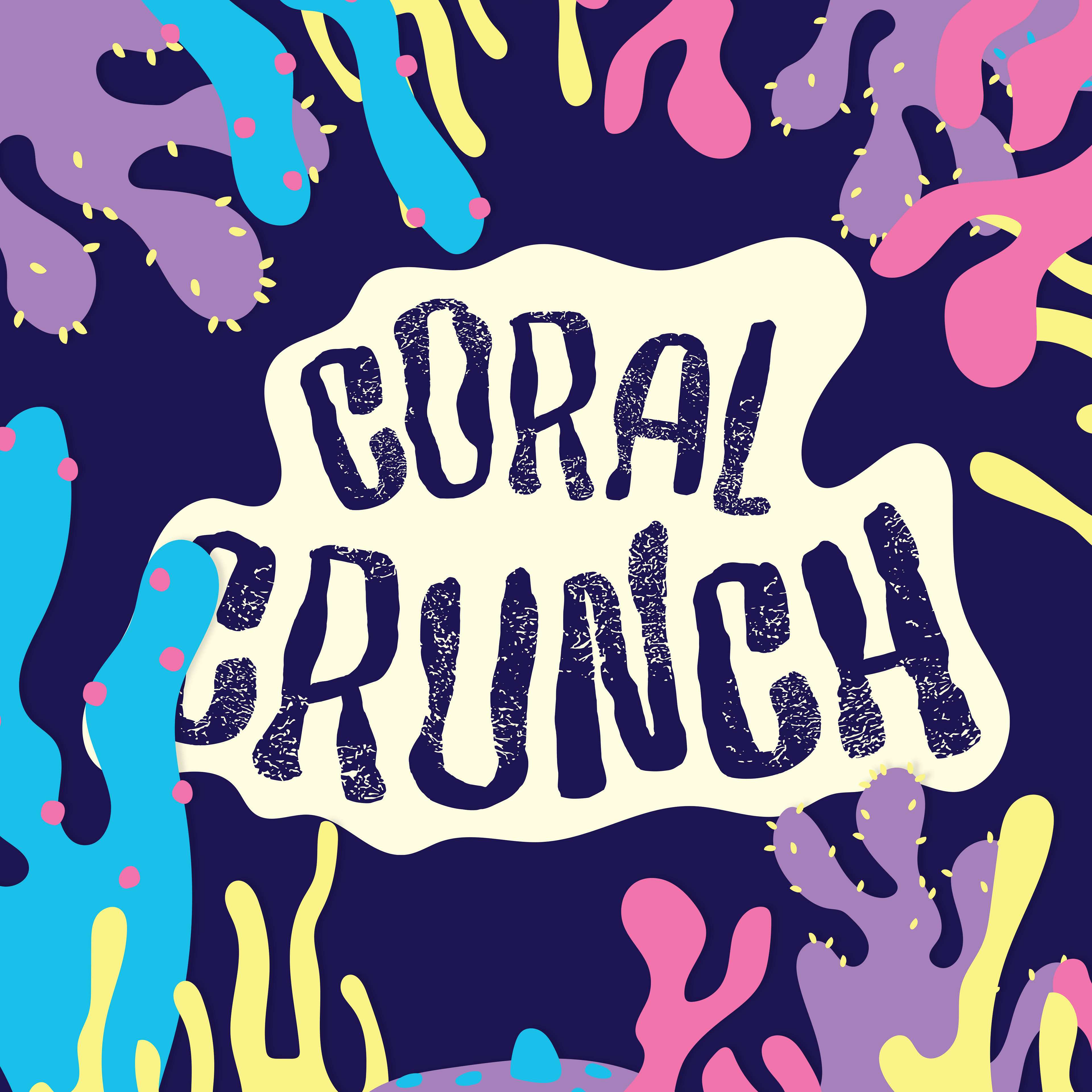
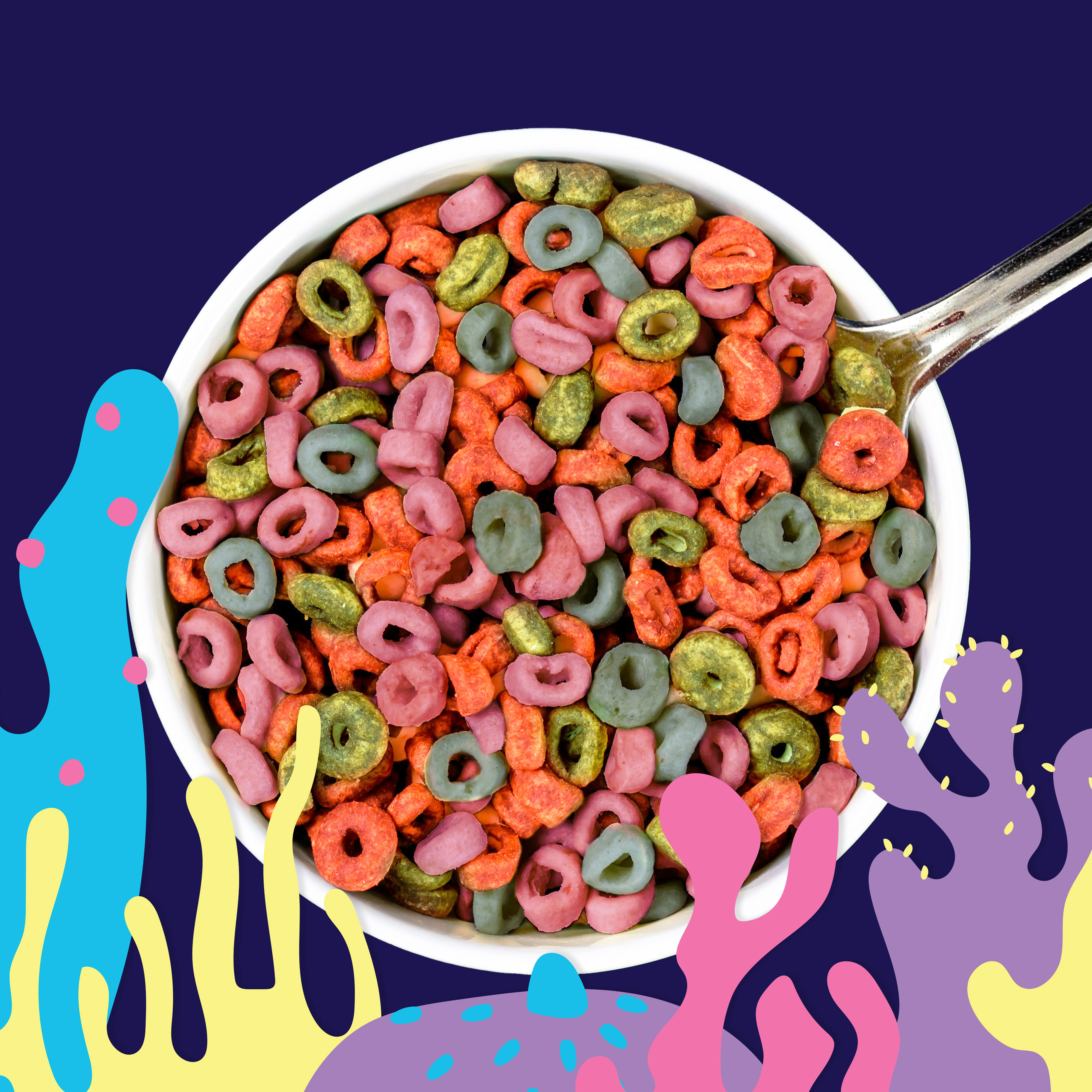
Finding imagery for the brand was challenging, at first I wanted to use imagery of coral reefs, oceans and pictures with signs of activism. However that is lost on children as they may not understand these concepts, so I decided to go with block colours and reusing the assets created for the packaging.
