Loop
Packaging, Illustration.
Loop makes reusable, stylish earplugs and with their old packaging it didn't feel stylish or bold at all so I decided to redesign the packaging myself as one of my projects. The struggle with this project was to make the packaging bold but not too 'loud' to contradict the product.
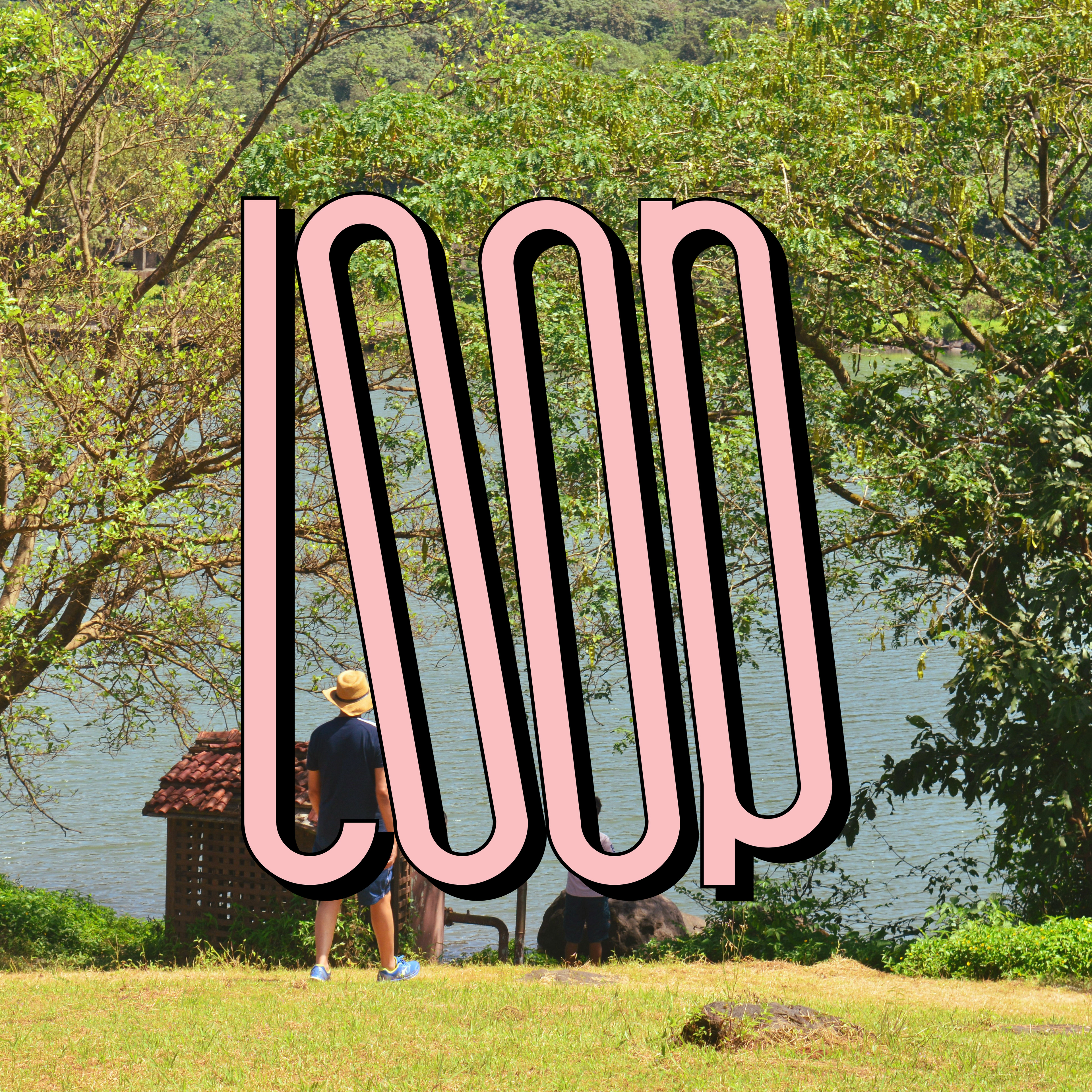
For the logo I loved the idea of using stretched type and to push that even further I decided to skew the type to make it pop.
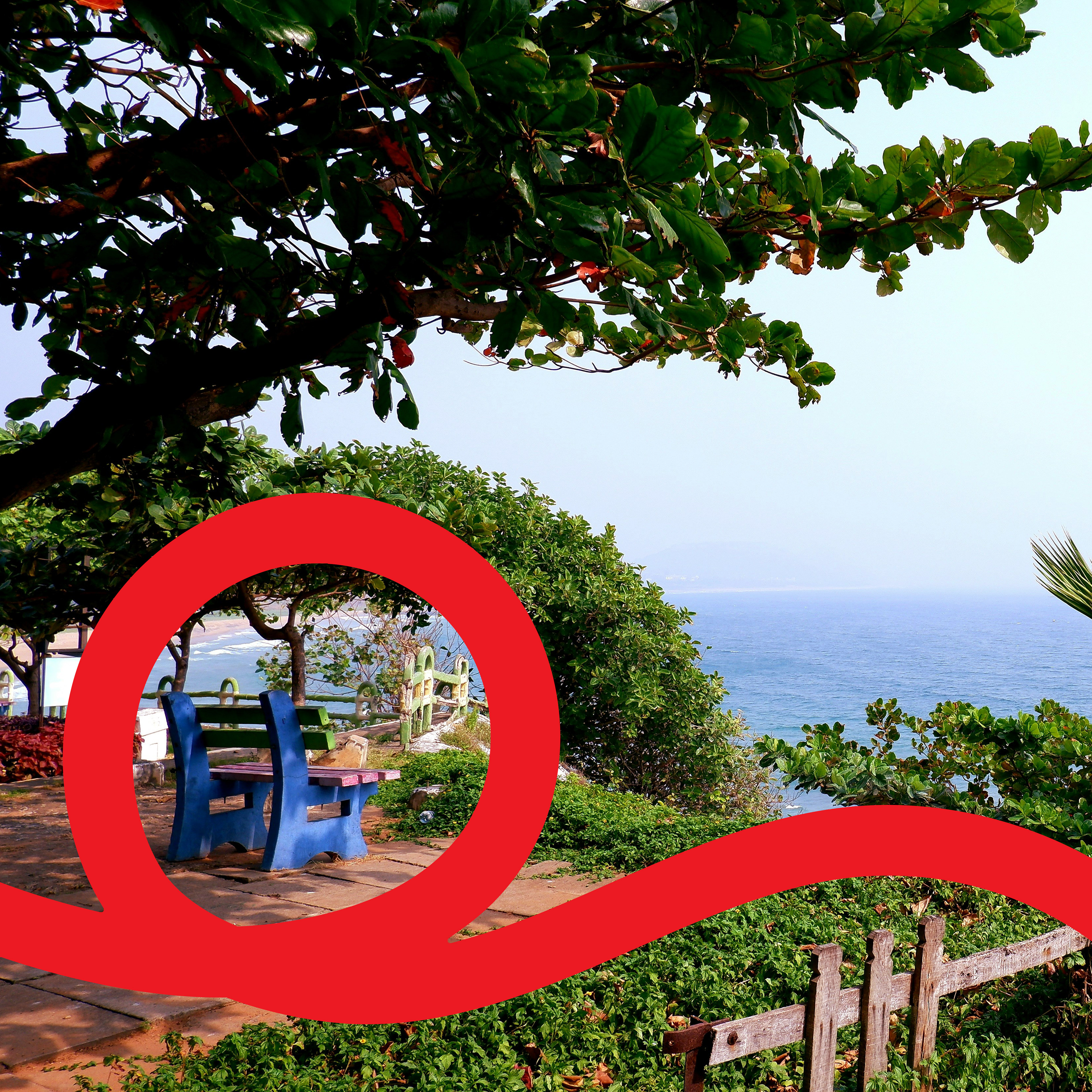
I wanted to make the packaging vibrant but not too chaotic to reflect the earplugs.
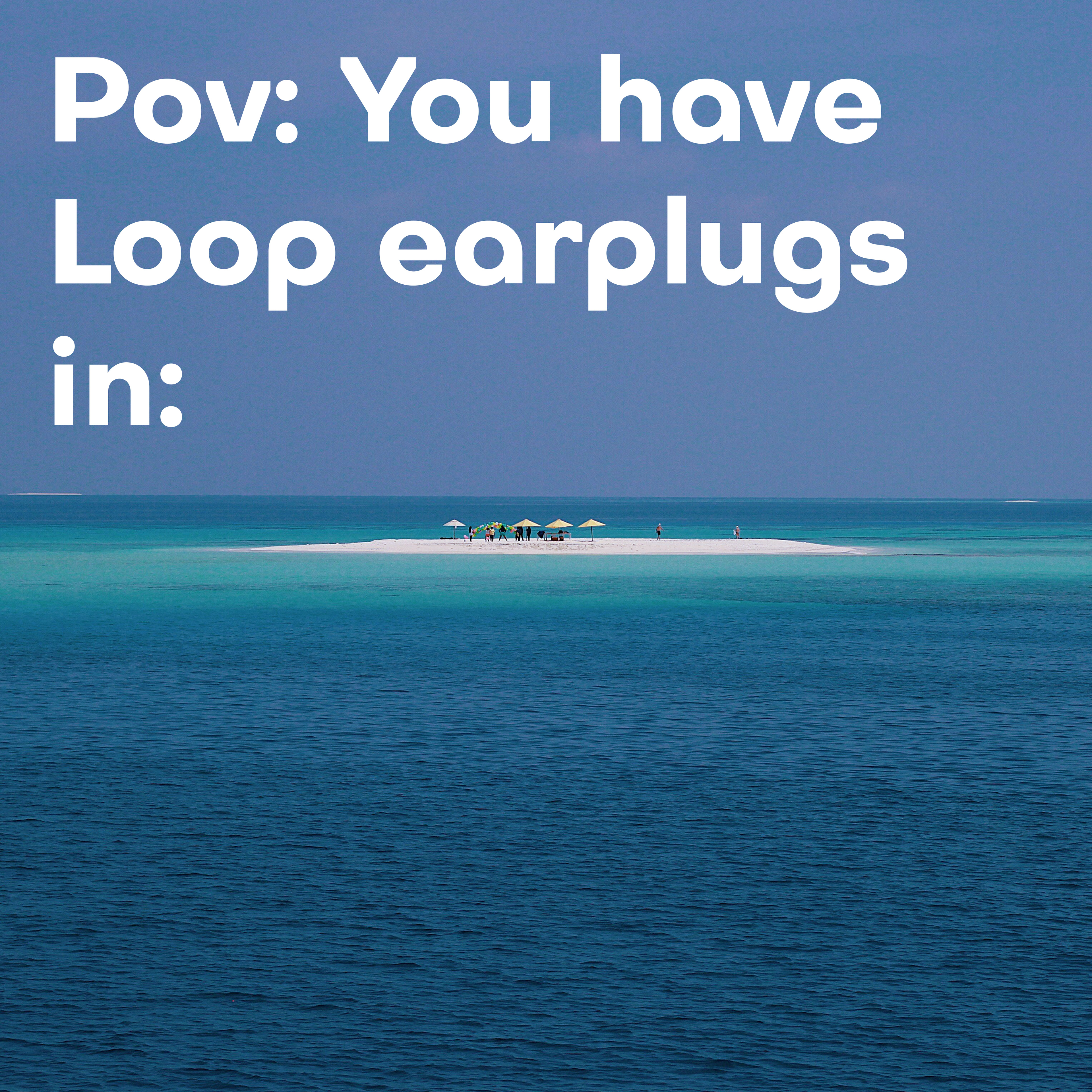
I chose to use photography of landscapes with people to make consumers associate with the campaign more which is also about calming the chaos hence the photos chosen.
