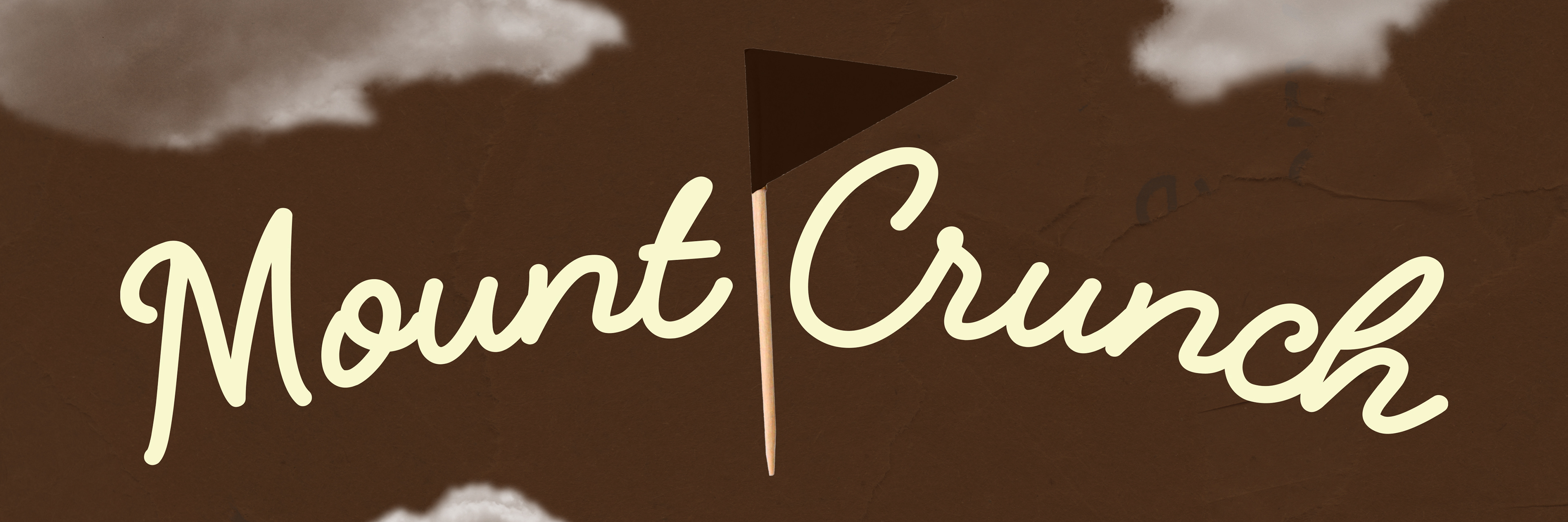
MOUNT CRUNCH
Branding, packaging.
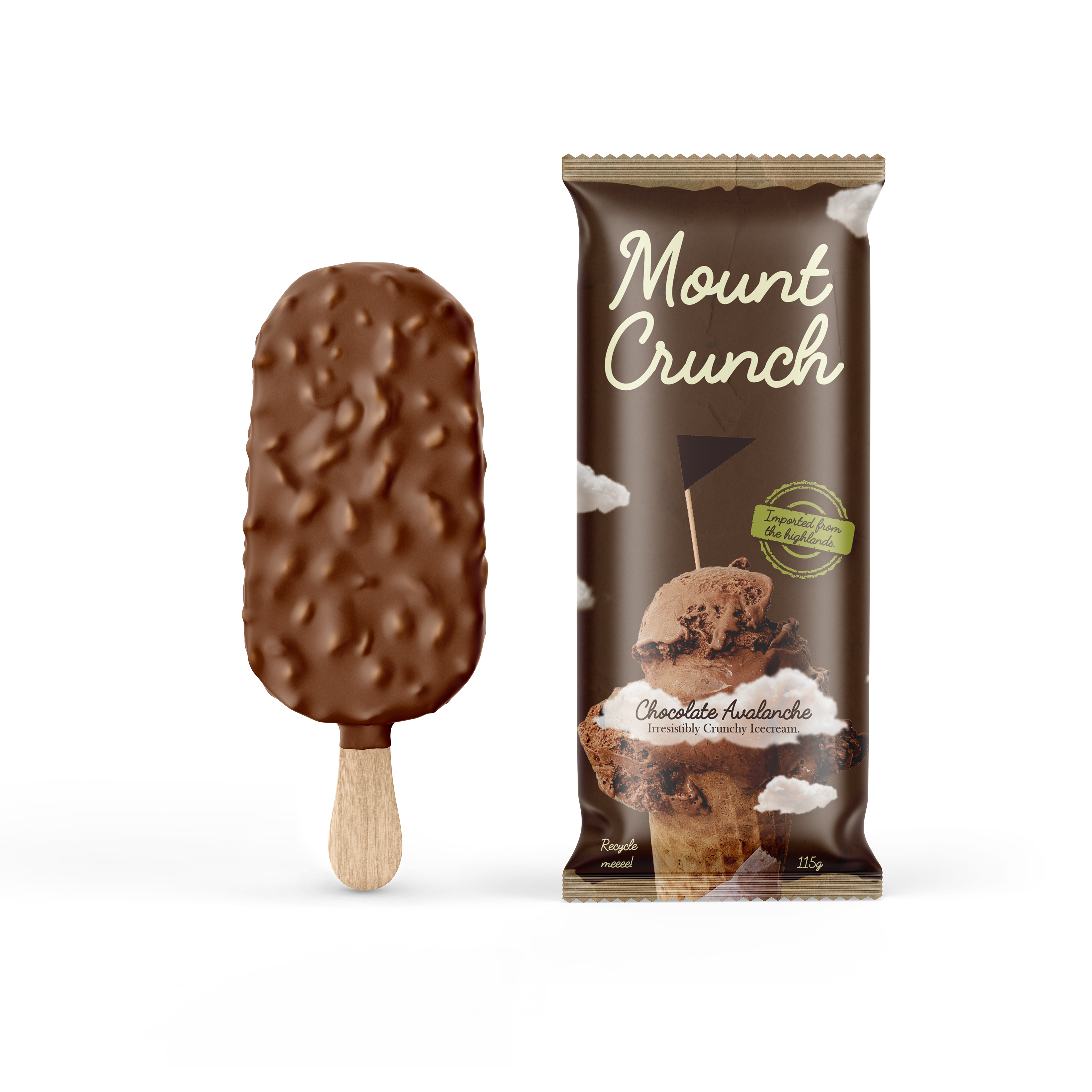
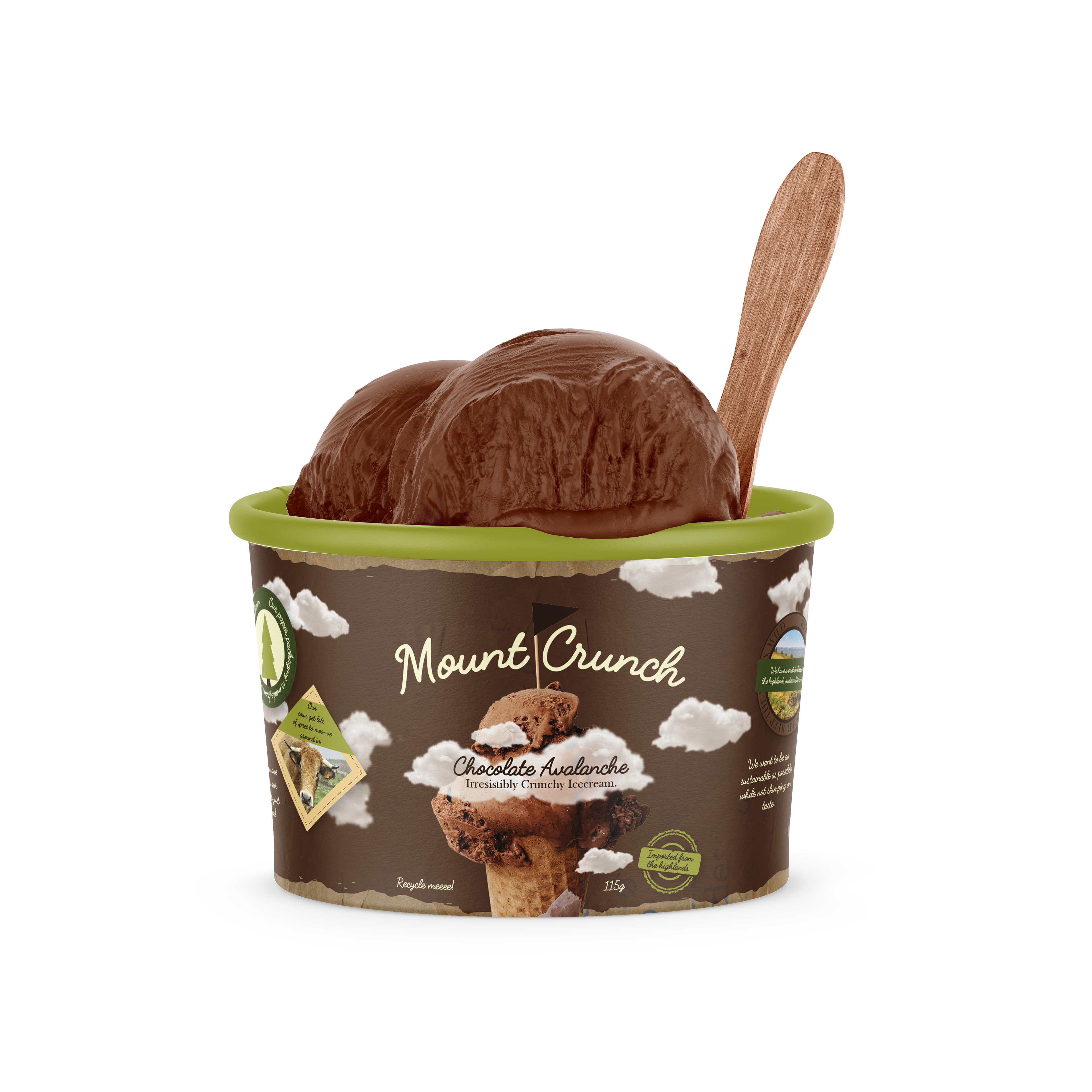
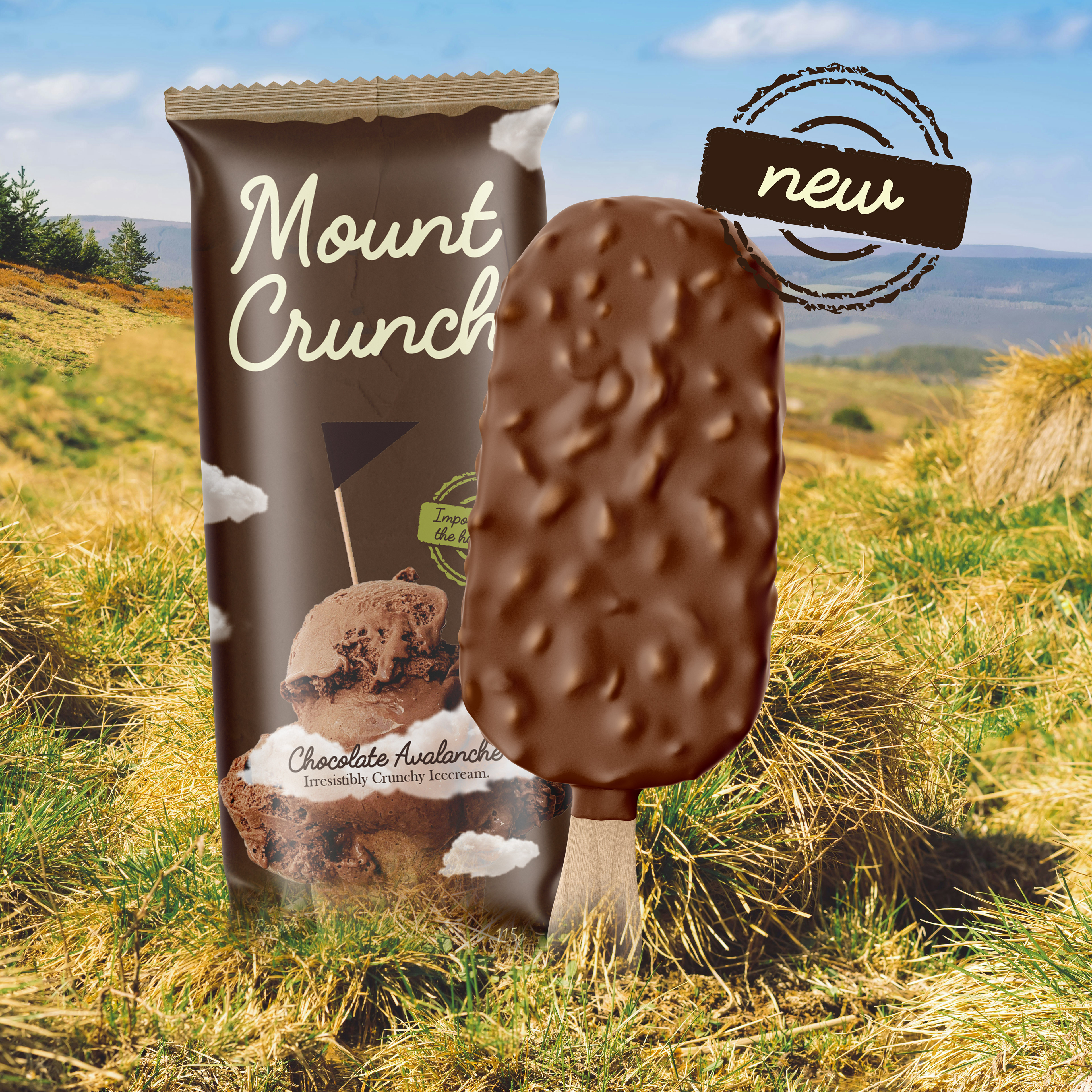
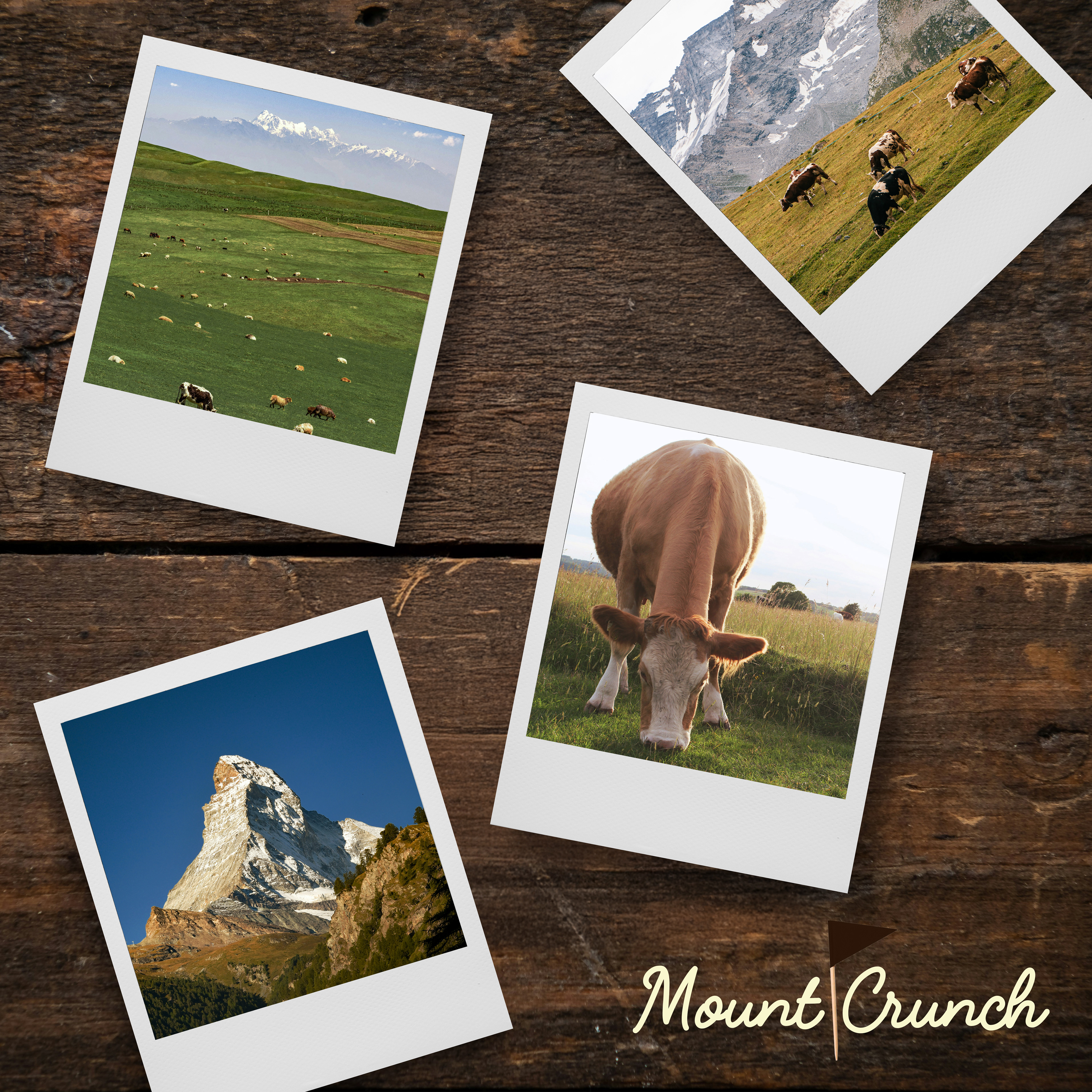
Mount Crunch is a self-conceptualised ice cream company, they're based in the highlands and are a small family-run business. This needs to be shown in the branding and packaging making it feel 'homely' and 'cosy'. They want to play homage to elements such as mountains and their selection of homemade ice creams that have a generous amount of toppings and flavour.
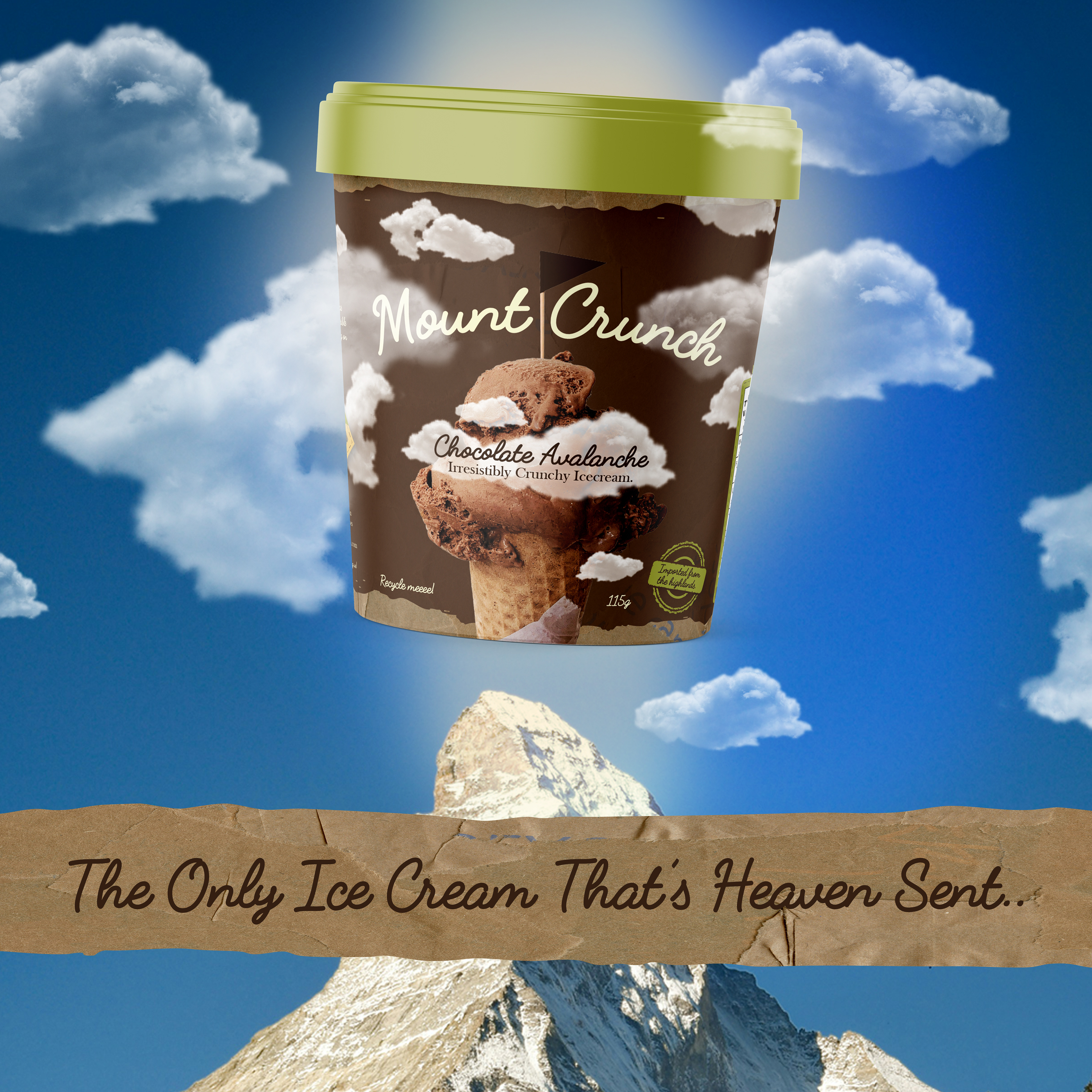
The branding needs to have good shelf presence while still keeping to the company's roots.

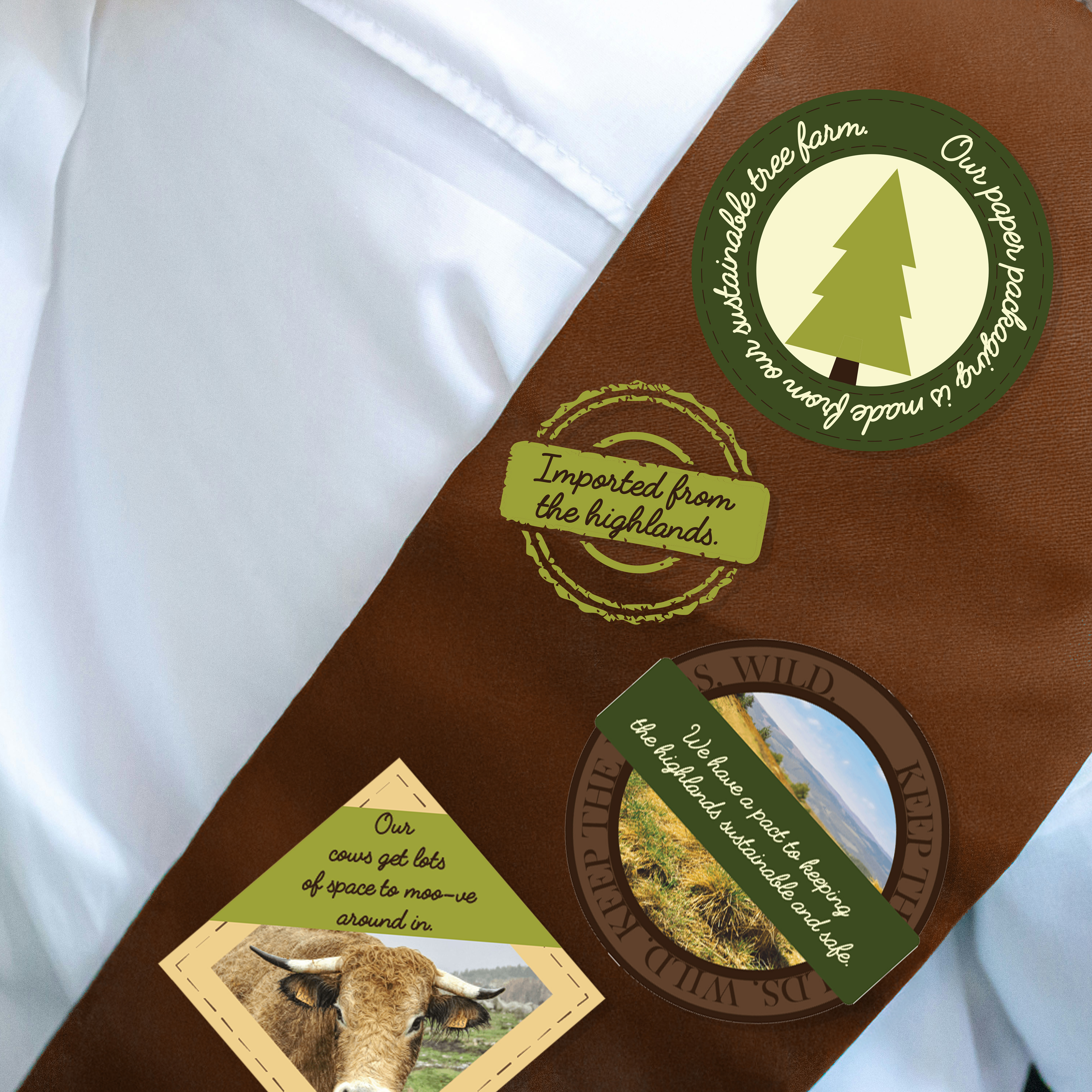
For the packaging design I thought it was important to use textures to make it feel hand made and 'local'. I decided to add information & content for the packaging onto badges connecting to the word 'mountain'.
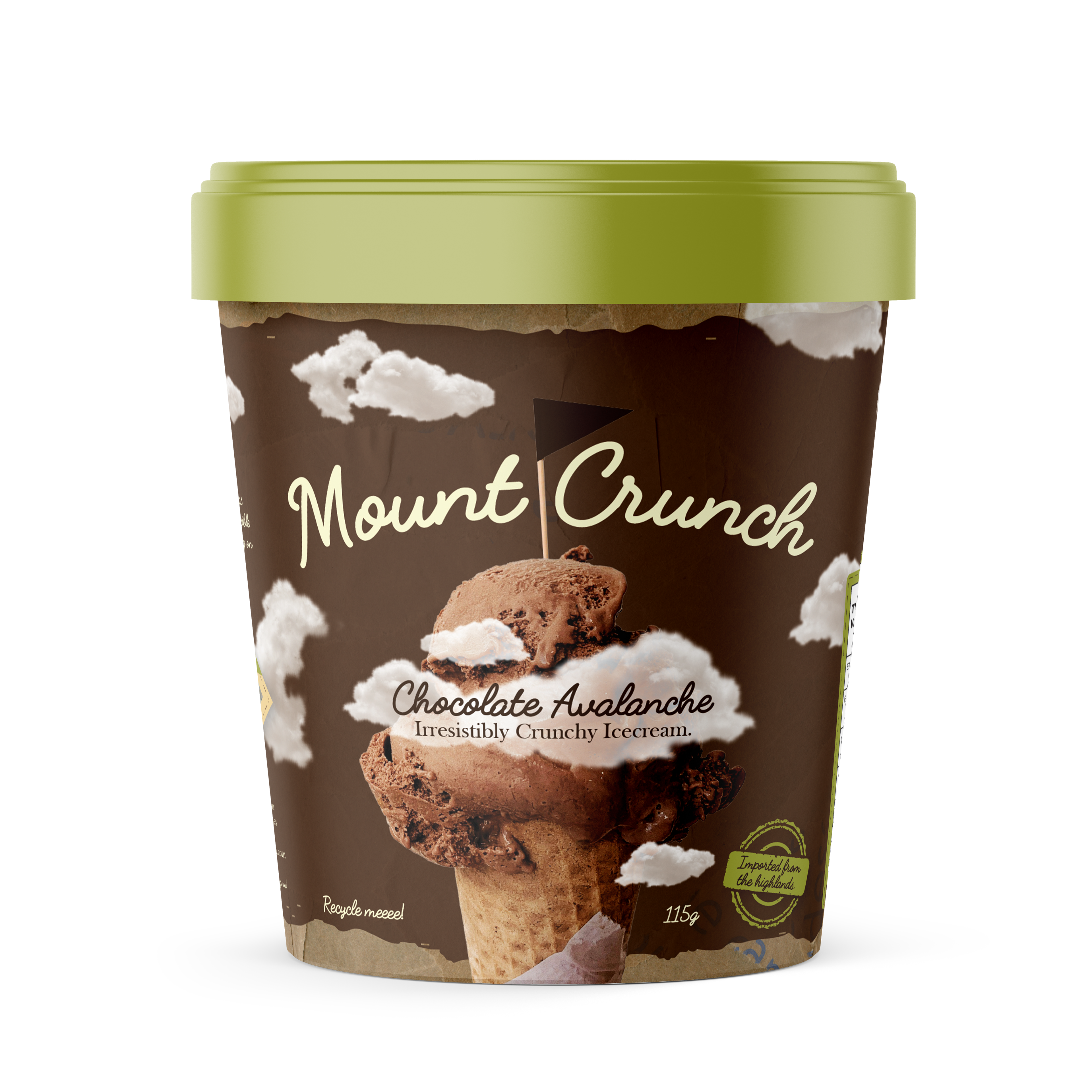
To create a call back to mountains and hiking I decided to add clouds around the packaging to symbolise the ice cream as a mountain peak.