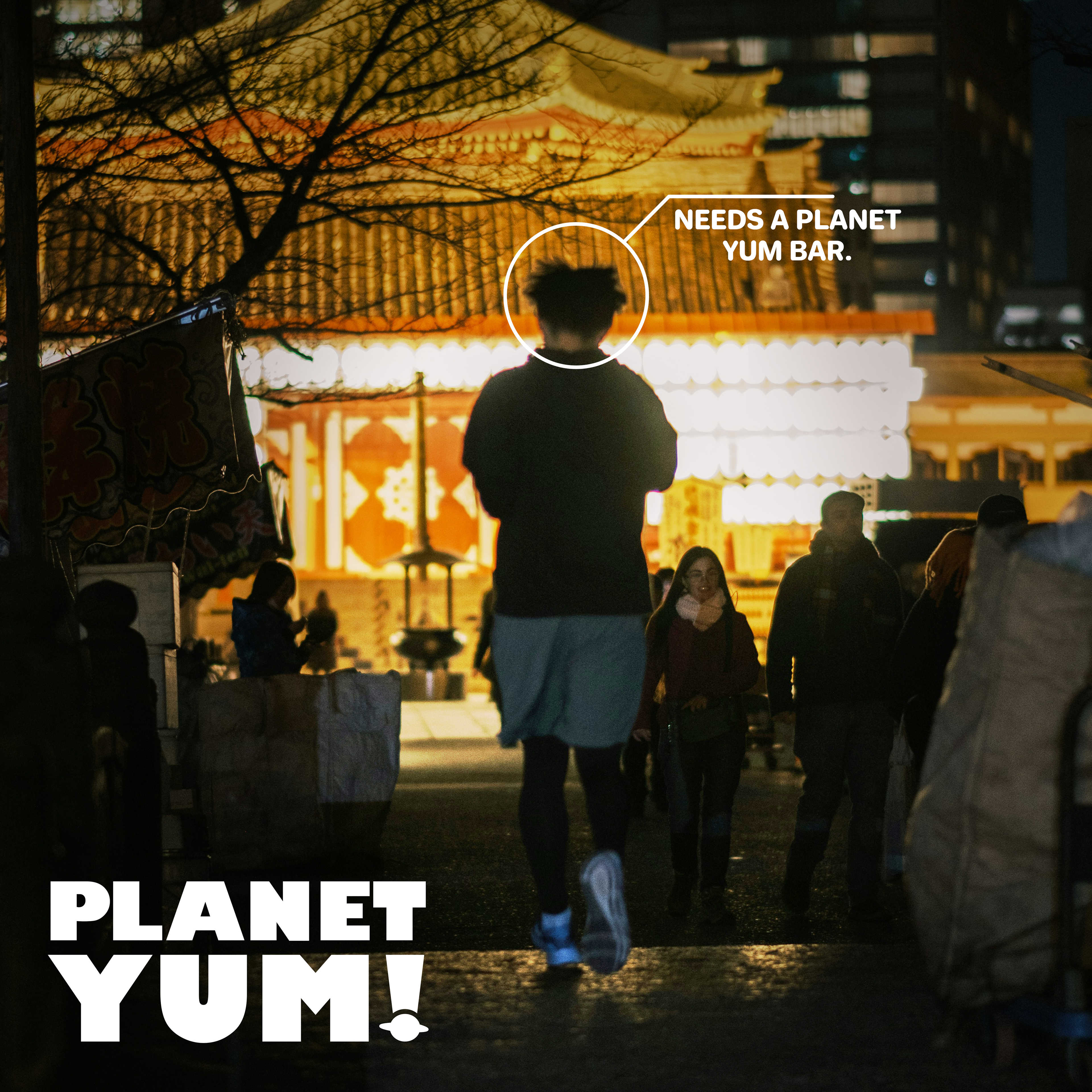
PLANET YUM
Branding, Packaging.
Planet Yum is a self conceptualised protein bar brand which I created to diversify packaging within the protein bar industry as when packaging of competitors I thought that packaging from brands looked very similar. So I came up with the name and idea of 'Planet Yum' as I wanted a catchy brand name with a theme I could base packaging off of.
The logo needed to be bold, impactful and to the point. To tie into the space theme I decided on changing up the exclamation mark to something more fun.
When designing the packaging I wanted it to be simple and still use block colours like other competitors while still changing it up. I decided on using an arrow system that looks straight out of NASA to make the packaging more quirky and on theme.


The imagery for this project focuses on candid exercise shots in the night to link to the space theme. I decided to go with a variety of different photos to make it appear more candid as everyone has their own fitness journey.
